DCU.org is a marketing and information tool for members and potential members. In addition to product information, the current site has information, forms, instructions, etc. for every transaction a member can make at the credit union but not all of the self-help information is easy to find when it is needed. A number of business areas have reviewed and provided insight, and recommendations to outline the problem areas and opportunities.
Members are contacting DCU to find out how to conduct transactions with their accounts and DCU. This leads to increase in call volume and frustration for customers. Much of this information is currently on the website but it is not easy to find and scattered all across the website.
consumer ux | banking
Designing a self-help experience for 1M+ credit union members to reduce call center volume by improving the discoverability of self-service actions.
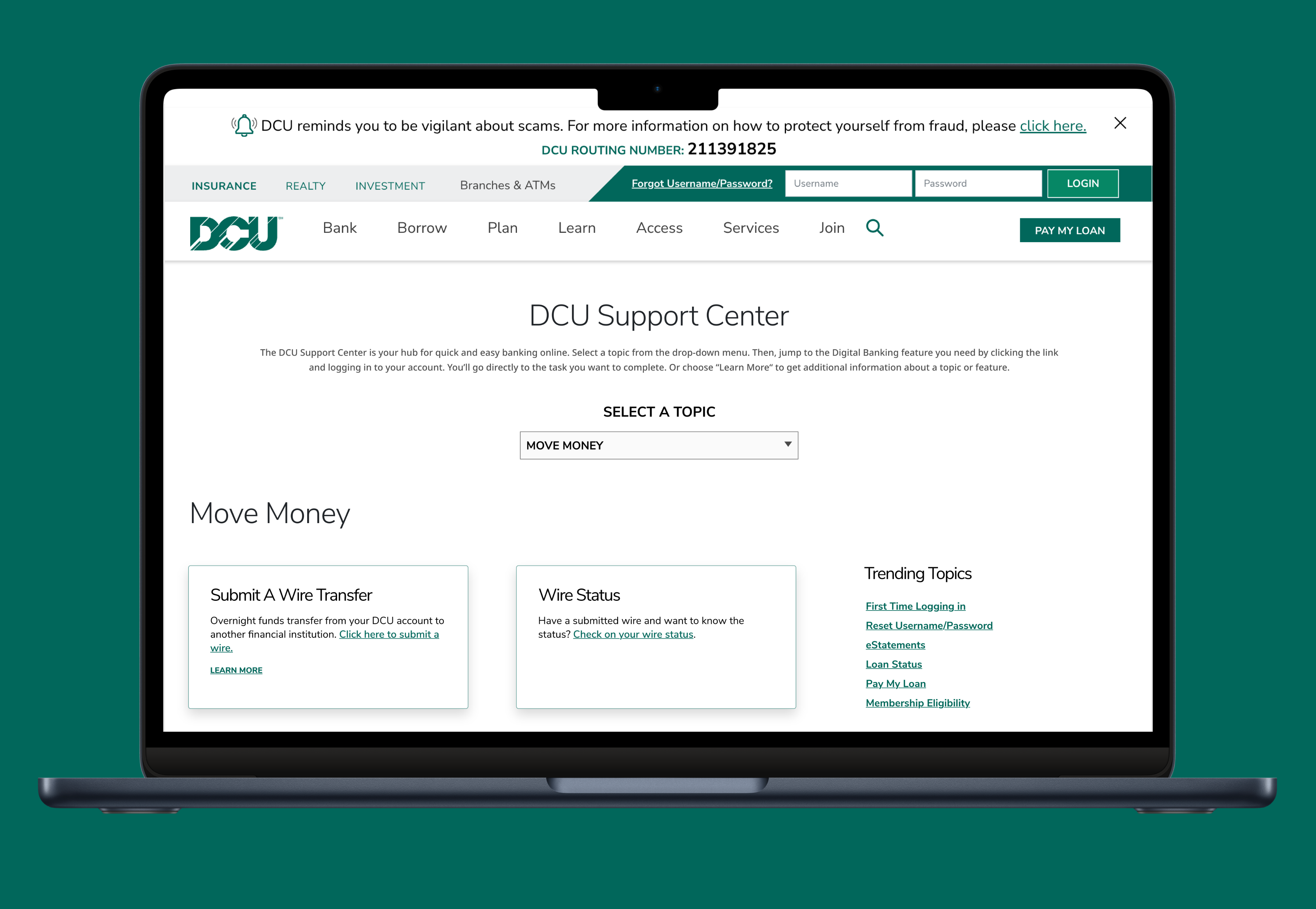 Visit Live Site →
01 — Overview
The Problem
DCU.org contained support information for most self-service actions, but it was fragmented across the site and difficult for members to locate. Some self-help information didn't exist online at all, leaving members with no choice but to call.
My Approach
I led end-to-end design for a new Support Center running stakeholder interviews, competitive analysis, card sorting with 30 members, and A/B usability testing with 60 participants to validate two IA concepts.
The Outcome
Ranked in the top 10 most visited pages on dcu.org within the first 30 days of launch. Member satisfaction score of 4.3/5 based on post-visit survey responses.
02 — The Problem
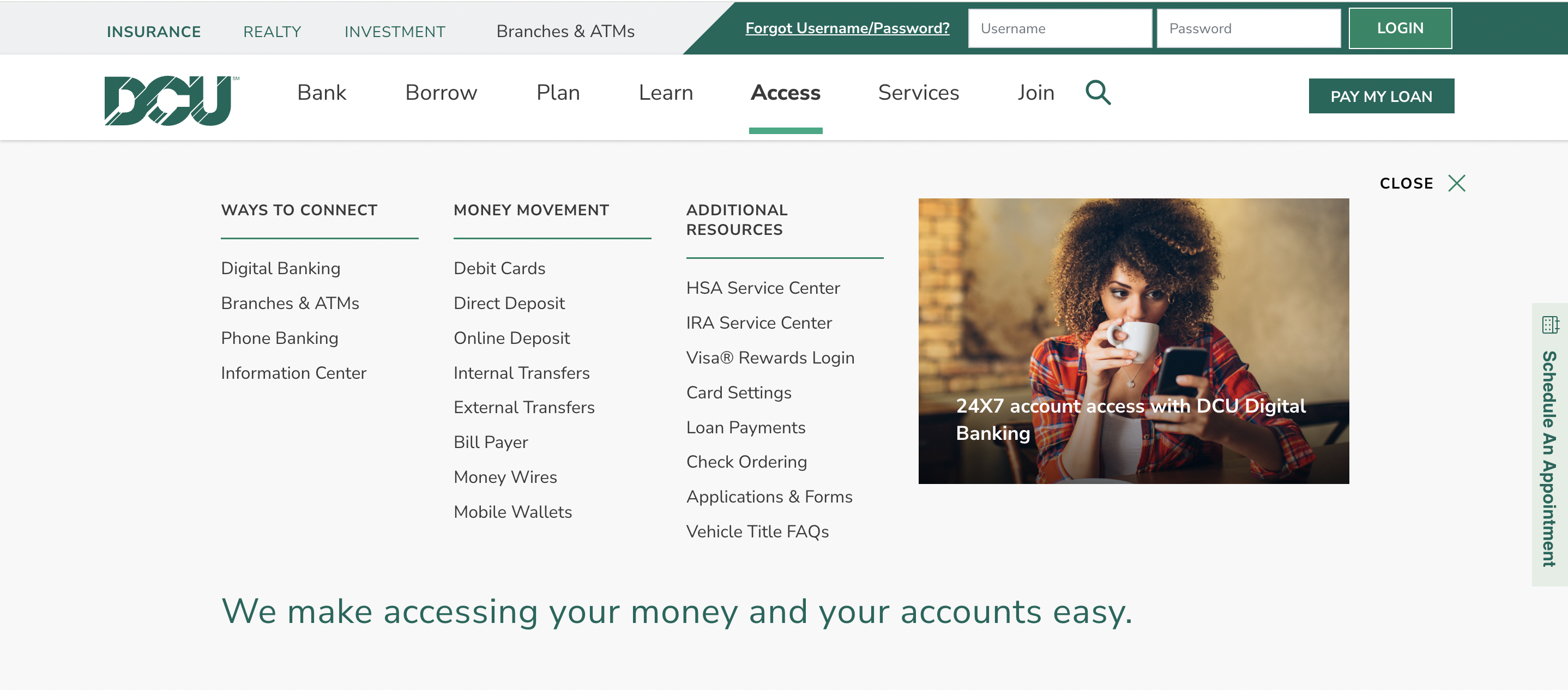
DCU.org had information, forms, and instructions for nearly every transaction a member could make but it wasn’t easy to find when needed. Content was scattered across the site and not organised around how members actually think about their banking tasks. With the launch of a new Digital Banking platform, this gap widened further.
Business Problem
Members were contacting DCU to find out how to conduct transactions and manage their accounts, leading to an increase in call volume and member frustration.
User Problem
Members wanted to be empowered to perform banking tasks when they chose to. But self-help information was scattered across dcu.org with no central place to find it, making calling easier than searching.
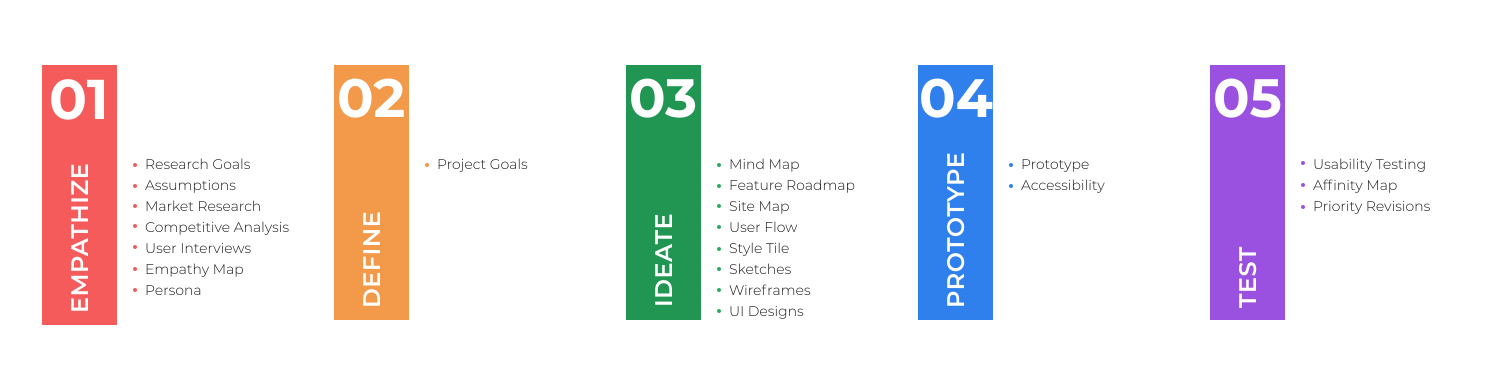
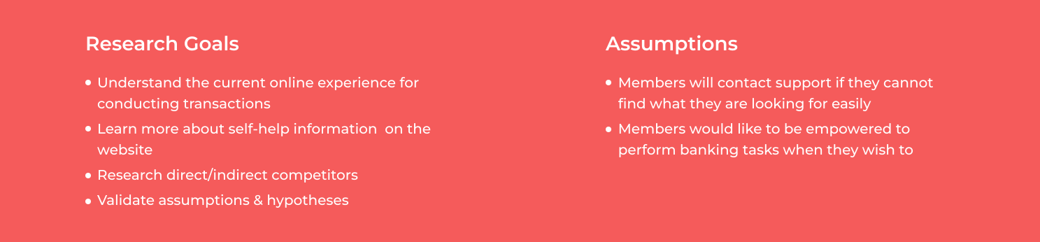
Started planning for research by outlining research goals, assumptions, methodologies, and timeline. I identified which customers should I target initially, what the best research methods are, and what the key areas of inquiry are. It helped me structure my approach to understand the opportunities in this area.
We conducted interviews with stakeholders to understand the problem space at hand and to uncover their pain points. After conducting the interviews, we analyzed the data, insights & recommendations provided by different business areas to identify requirements.
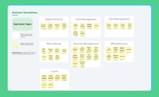
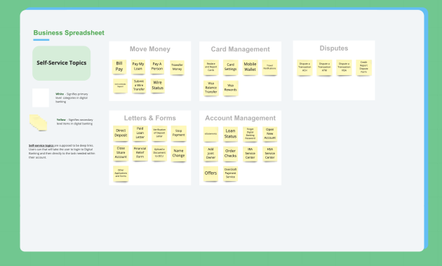
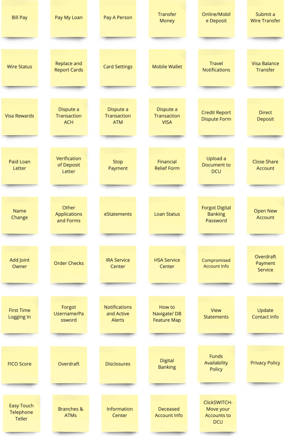
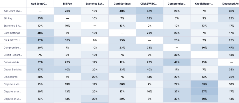
Since this would deal with the Information Architecture, so I wanted to perform a card sort to discover how people understand and categorize information so that I can organize and label content in a way that makes the most sense to members. I ran an open card sorting exercise with 30 participants online on UserZoom. Participants were asked to sort 53 cards into groups of their choosing and then were asked to name each group according to their understanding.I synthesized the findings to look for common patterns and also looked at how participants classified the information under different topics. Card sorting also helped to capture the different verbiage used by participants to group items.
.svg)
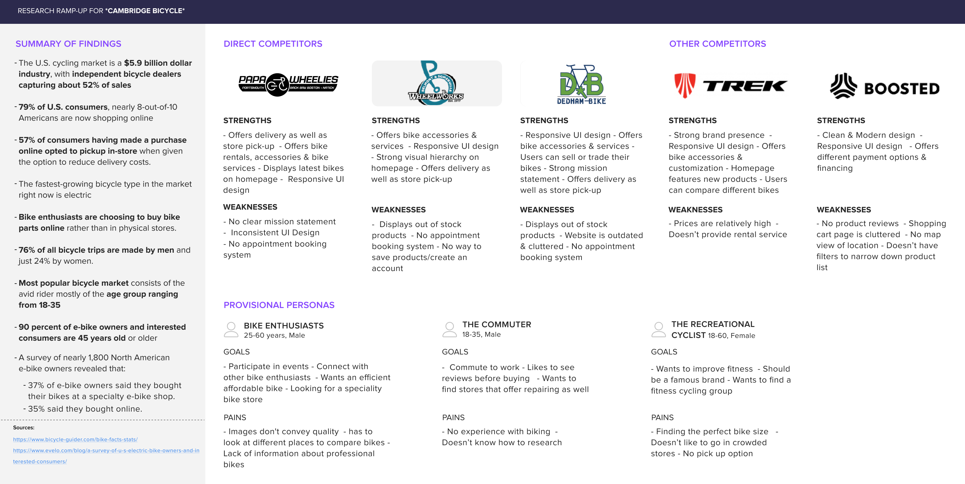
I performed competitive analysis on direct and indirect competitors to to understand what’s currently available to customers as well as identify their strengths & weaknesses
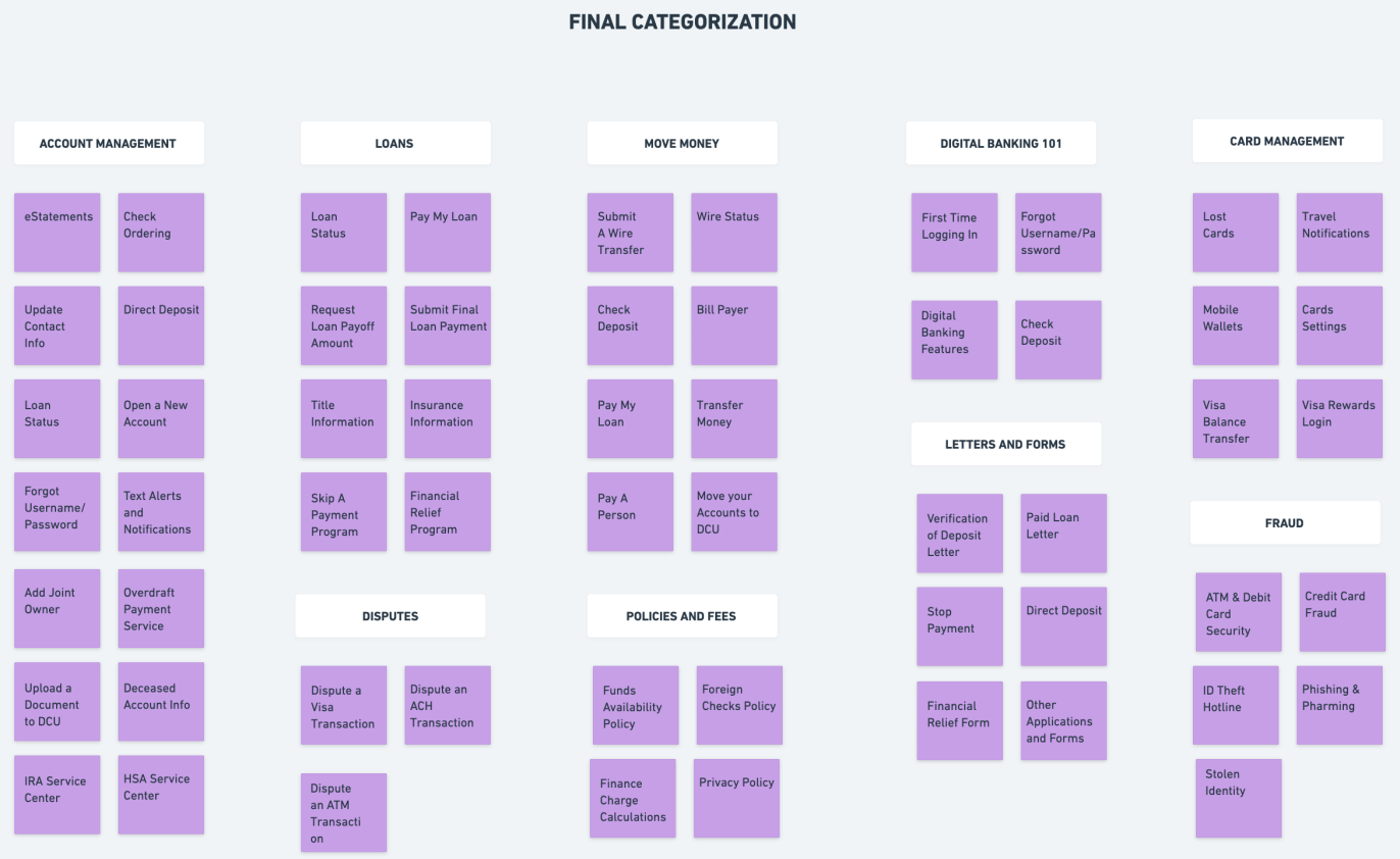
I synthesized the research by analyzing the data from business, results from competitive analysis & card sorting and to understand the pain points, frustrations, feelings and needs of users.I started by mapping out the user responses on post-it notes to gain a deep understanding of their experiences. Then, I looked for common patterns and created a cluster to capture the categorization.
03 — Research
Stakeholder interviews, competitive analysis, and card sorting informed the research, helping define the problem space and reveal how members organize and interpret support content.
Stakeholder Interviews
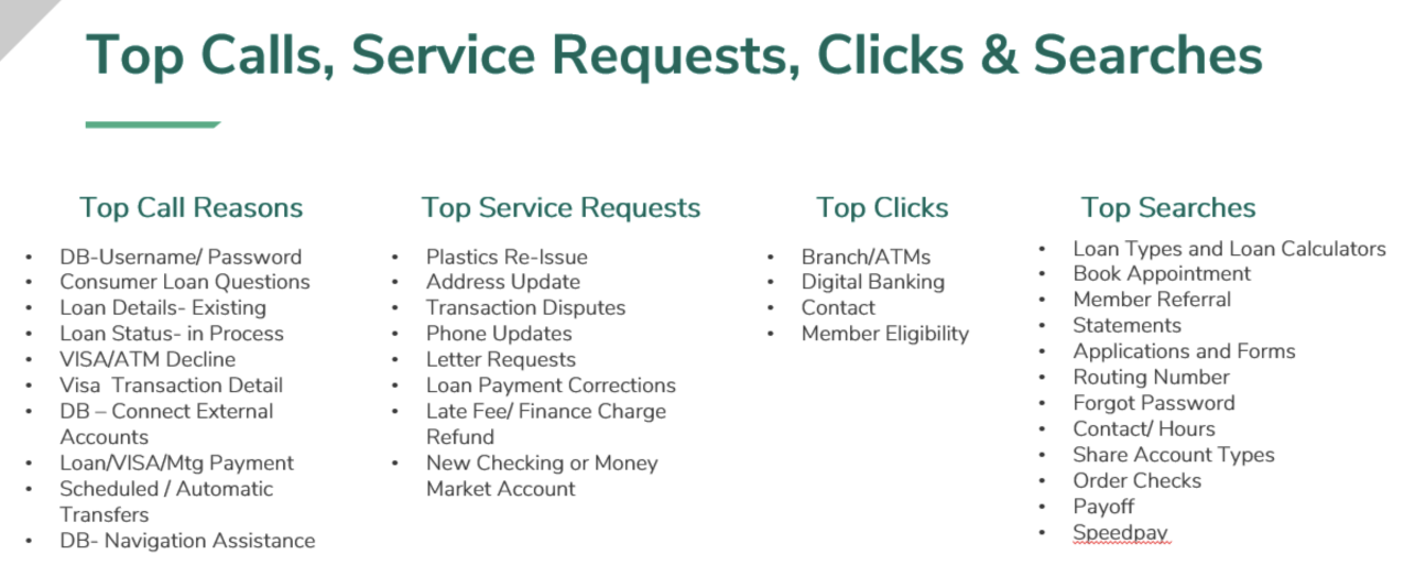
Interviewed DCU business stakeholders across multiple departments to understand the problem areas, top inbound call drivers, and opportunities. Transfers and mobile banking were identified as dominant call categories.
Card Sorting — 30 Participants
30 DCU members sorted 53 cards in an open card sort on UserZoom. 9 categories emerged from the results — including Account Management, Payments & Transfers, and Card Management — which directly informed the navigation structure.
Competitive Analysis — 4 Competitors
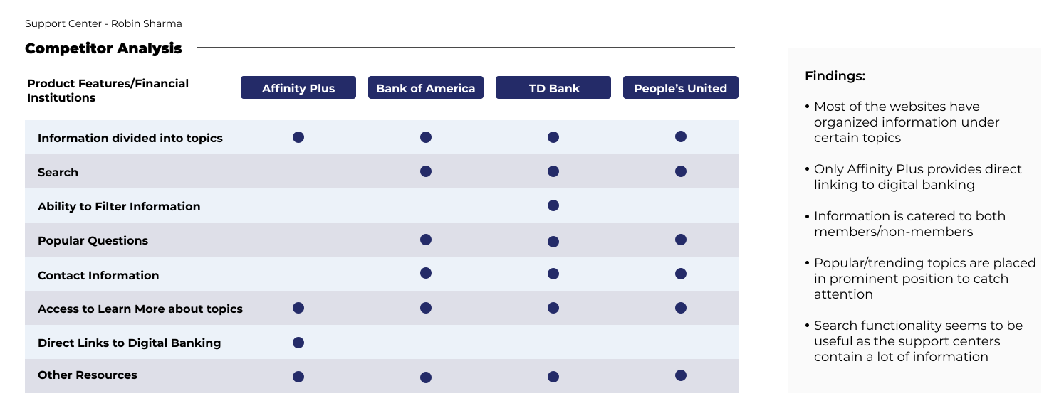
Analysed Affinity Plus, Bank of America, TD Bank, and People's United. All four organised information under topics, and most included search and popular questions in a prominent position to help members find answers quickly.
Stakeholder Interviews
Operational data showed strong overlap between top calls, service requests, clicks, and searches. Members were already trying to self-serve, but fragmented navigation and missing task-focused content made information hard to find reinforcing the need for a centralized, task-based Support Center.
Competitive Analysis — 4 Competitors
Audited how other financial institutions structured their support centers both direct competitors and best-in-class examples. The goal was to identify common features/patterns. I analysed Affinity Plus, Bank of America, TD Bank, and People's United. All four organised content under topic-based categories rather than product lines. Most included search and surfaced popular questions prominently. Only Affinity Plus provided direct links to digital banking. These patterns validated a topic-based navigation model and informed the decision to include a prominent popular topics section.
Card Sorting — 30 Participants
Because the challenge centered on information architecture, an open card sort was conducted to understand how members naturally group and label support content. 30 participants completed an online study in UserZoom, sorting 53 cards into categories of their choosing and naming each group based on their understanding. The results revealed common task-based groupings and surfaced member-driven terminology, helping shape the organization, labeling, and structure of the Support Center.
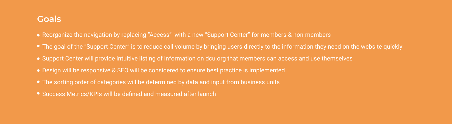
After synthesizing research findings and uncovering needs, next step was to define project goals that allowed me to look at a fresh perspective on the problem from the user’s point of view. I combined business goals from the initial Design Brief and user goals from my Empathy Map, taking into account technical considerations, to visualize how to prioritize features to design for the minimum viable product.
04 — Key Findings
Synthesising across all three research streams surfaced a consistent pattern: members think about support in terms of tasks, not products. Three insights directly shaped the design decisions that followed.
Finding 1 → Design Decision
Card sorting showed members grouped content by task not by product or account type. → Navigation was designed around 9 task-based topic categories rather than DCU's internal product hierarchy.
Finding 2 → Design Decision
Stakeholder interviews highlighted a discoverability gap that members were attempting to self-serve but struggled to locate information across the existing site. → The Support Center was designed as a centralized, task-focused entry point to make self-service actions easier to find
Finding 3 → Design Decision
Competitive analysis showed that effective support centers organize content using topic cards and surface popular questions prominently. → The Support Center adopted a visual topic-card layout with a dedicated popular topics section to support quick self-routing
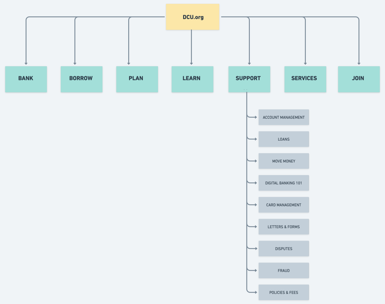
Building from the product goals, feature roadmap, and card sorting results, I created a sitemap that included proposed pages to help plan the structure of the website. By visualizing the information architecture and identifying key relationships between screens, we can better understand the flows and interactions throughout the site.
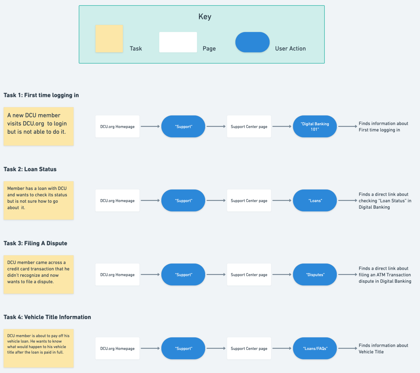
Creating a task flow helped to identify which pages were required within the customer’s process and forced me to think through the customer experience in more detail. Also, once I have the main flow ready, I can use use these tasks to test it out with users. I designed the task flow by breaking down the necessary steps for a user to get from the landing page to the order confirmation page. I was able to outline the screens that need to be created through a task flow exercise.
05 — Design Process
With research complete, the focus shifted to translating insights into structure and interaction.
Concept A — Search-first
A minimalist entry point centered on a large search bar. Browse was secondary. Hypothesis: members who know what they need will resolve their issue faster if search is the primary action. Risk: members without the right vocabulary would still struggle.
Concept B — Browse-first
A visual topic card grid with 9 category tiles plus a secondary search bar. Hypothesis: visual scanning reduces cognitive load for members who can't formulate a search term. This directly addressed the card sorting insight about task-based mental models.
I brought both concepts into Figma as lo-fi wireframes and ran them through a round of informal critique with the product team before building out hi-fi prototypes for A/B testing.
Site map
Based on the final categorization from card sorting, a sitemap was created to structure the Support Center around 9 main task-based groups. The sitemap helped define page hierarchy, clarify relationships between topics, and align the overall navigation with how members naturally organize self-service information.
TASK FLOW
Task flows were created to map how members move from the Support Center landing page to completing a self-service action. Breaking down each step helped define the required screens, clarify navigation paths, and ensure the experience supported real member tasks. These flows also informed the usability testing scenarios used to evaluate the design.
Lo-fi Wireframes
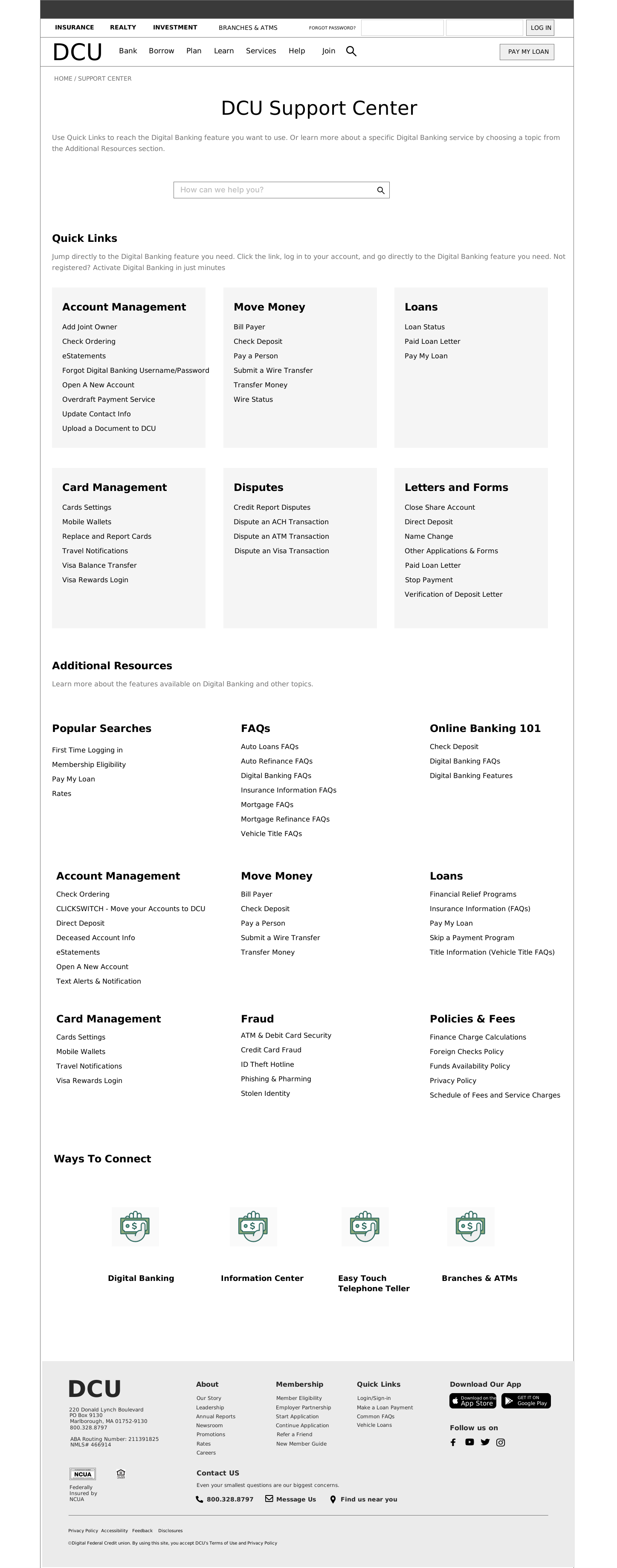
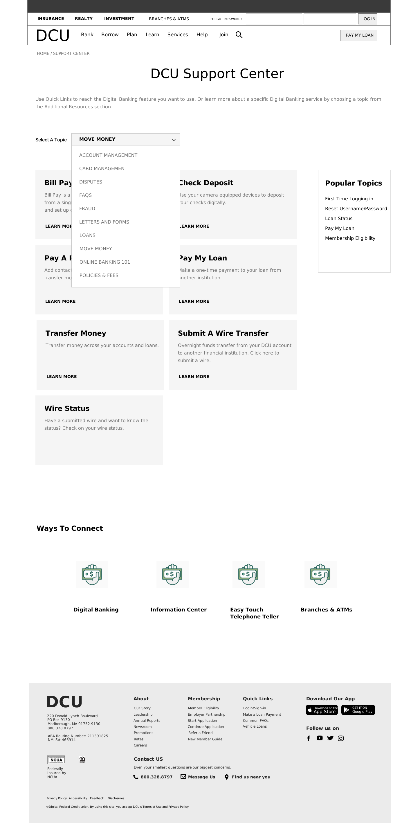
Guided by the sitemap and task flows, the core design question became how members should navigate and interact with the 9 task-based categories. Different lo-fi approaches were explored to test how structure and interaction could best support self-service tasks
1) Concept A put all self-service content on a single page, grouped under each category. Members could see every topic area at once and scan the full landscape without navigating away. The hypothesis was that visibility reduces friction: if a member can see everything, they are less likely to call because they couldn't find the right entry point.
2) Concept B used a category filter. Members would select a topic and the page would update to show only the content within that category one topic at a time. The hypothesis was that reducing the amount of visible information at once would help members find infomration easily. The tradeoff was that members unsure of their category would need to explore before landing in the right place.

Hi-fi Prototypes
Both lo-fi concepts were presented to the team and stakeholders for feedback. The cognitive load and mental model of online banking members were central to the discussion. Based on that feedback, I iterated on the designs and turned both concepts into fully functional hi-fi prototypes. These were built to demonstrate core functionality so they could be tested with real users in an A/B study on UserZoom. I worked with graphic designer to get specific icons for these categories.
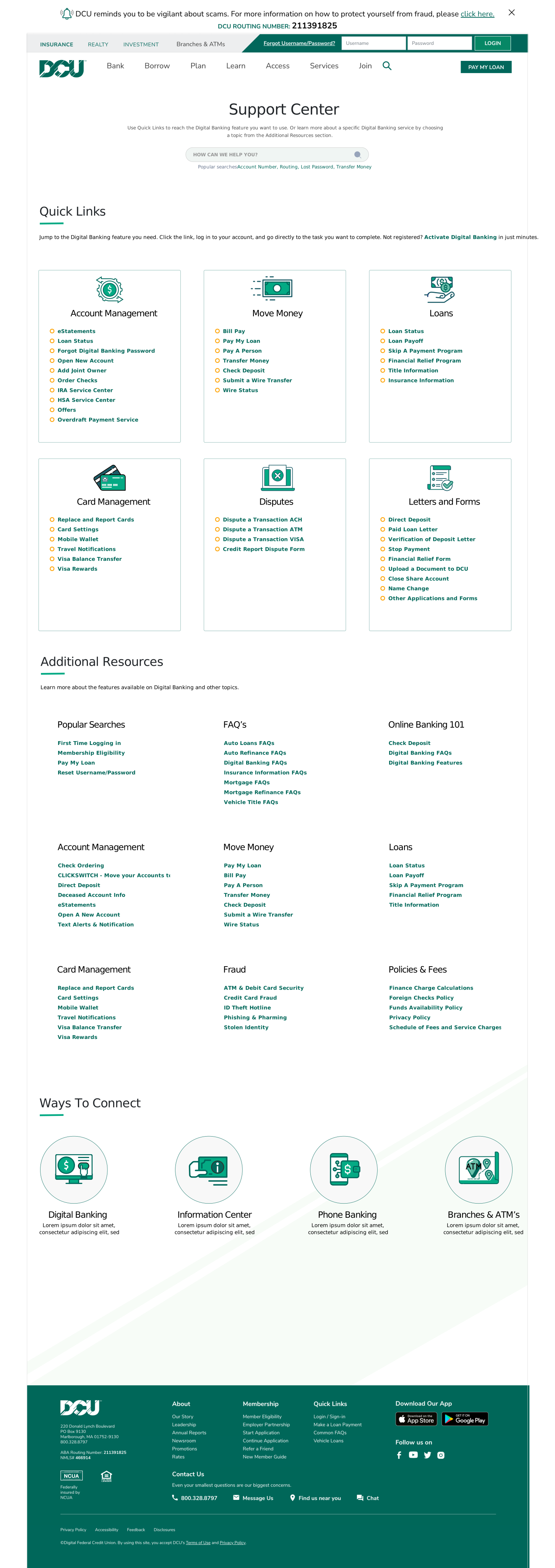
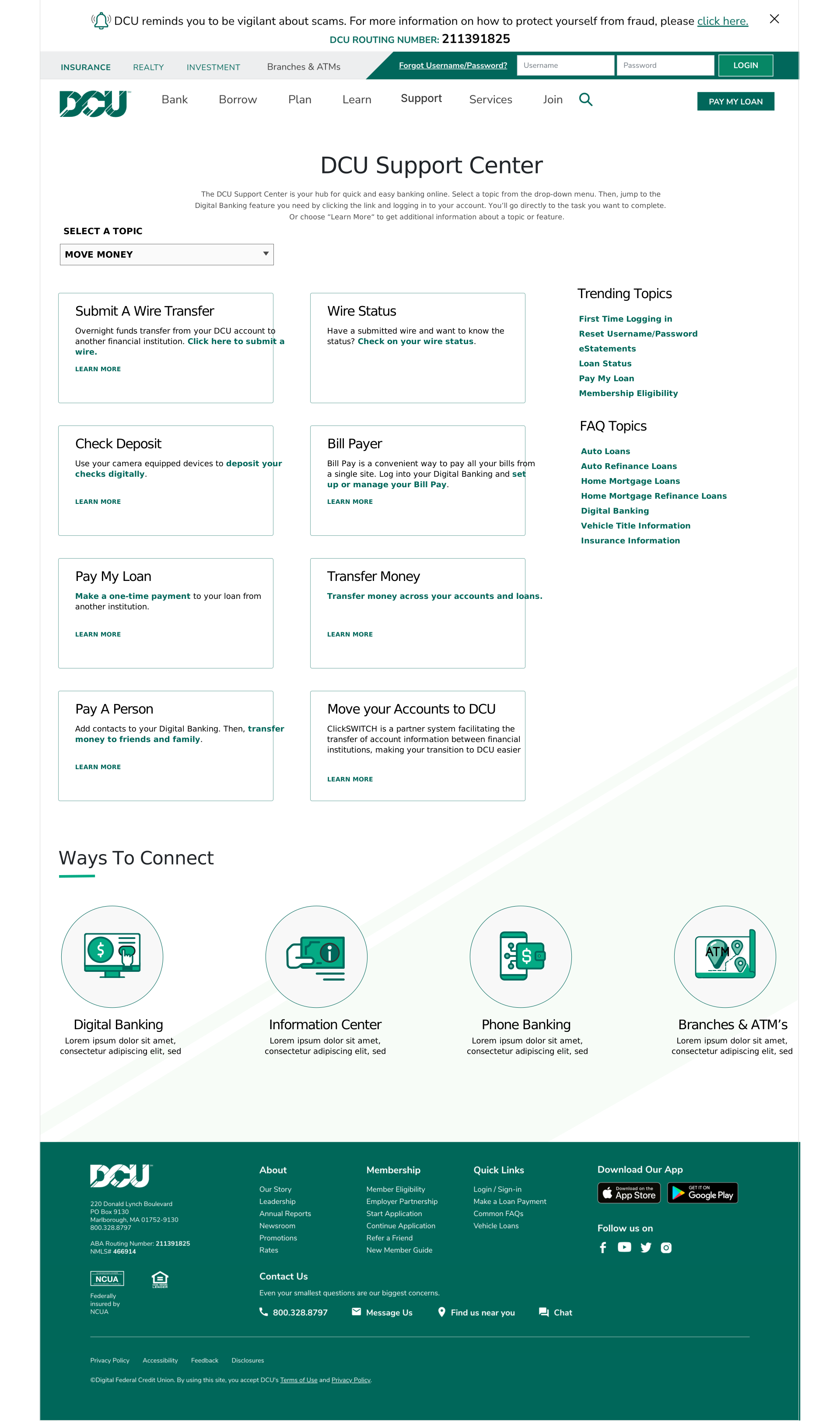
I started the design phase after understanding the technical, business & user requirements.I designed a couple of low-fi concepts based on research & goals and presented them to the team for feedback. The 2 concepts were based keeping in mind the cognitive load as well as the mental model of users who use online banking actively. I used common design patterns and established the sizing & placement of content elements. Since the goal was to create a responsive design, I first started with desktop versions and based on the feedback, I iterated on it and then jumped to mobile wireframes. I focused on keeping consistency across screens & devices I hoped to discover any issues that could be resolved before working on the visual design.
Iterated on low-fi wireframes based on the feedback from the team to create hi-fi wireframes. Worked closely with a design consultant regarding the visual design. Identified areas of improvement for ex. added a section about FAQ Topics to provide more visibility.
06 — Usability Testing
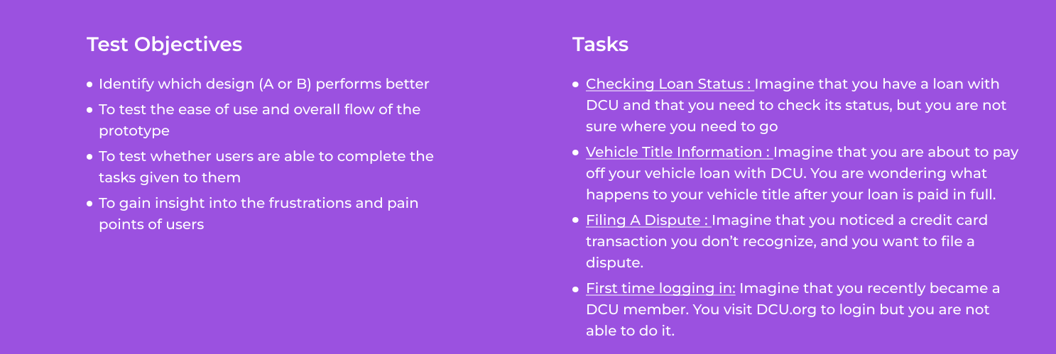
Before testing, a structured plan defined the study goals, success criteria, and evaluation approach. A remote unmoderated A/B test was conducted on UserZoom with 60 participants, split evenly between two design concepts. The study focused on whether members could locate self-service actions easily and which structure better supported task completion. Screening questions and short surveys provided additional context about participant behavior and confidence.
93%
Avg task completion Concept 2
80%
Avg task completion Concept 1
4.1/5
Avg Ease of use Concept 2
3.6/5
Avg Ease of use Concept 1
Concept 2 outperformed Concept 1 across every measure. Concept 2 topic cards gave members a visual path forward even when they couldn’t name what they were looking for.
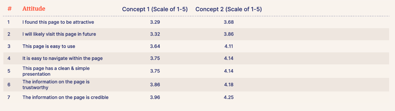
Attitude scores told the same story: Concept 2 rated higher on all 7 dimensions, with the biggest gaps on attractiveness (3.29 vs 3.68) and likelihood to return (3.32 vs 3.86)
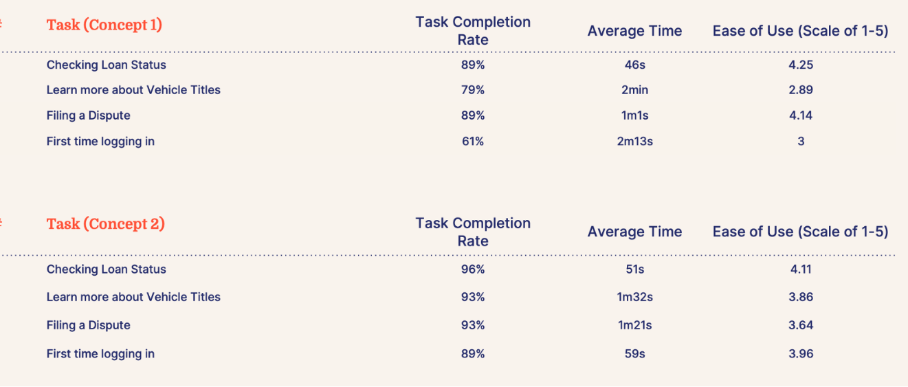
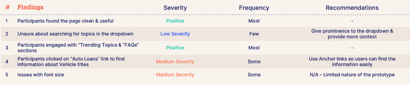
Based on session recordings and the findings table, one priority revision was made before handoff: the category dropdown on Concept B was repositioned to be centred and more visually prominent, so members could immediately see the filtering mechanism rather than overlooking it.
Before conducting user testing, I developed a Testing Plan that detailed the project goals, objectives, and procedures. The testing plan helped to set expectations for the kinds of feedback I was hoping to receive and finalize on the aspects of the design that need testing.I conducted an A/B test with 60 participants on UserZoom. Our study was set up in a way that 50% of participants would see design 1 and the other 50% would see design 2. Our study aimed to identify which webpage design (1 or 2) performs better and if users can find what they are looking for easily. Along with a couple of screening questions, I also defined some survey questions to get to know the audience better.
After conducting usability testing, I compiled my notes and observations from the usability testing and analyzed the study results. I drew insights from the synthesized information and identified design recommendations and presented that to the team & senior management. Iterated on the design based on recommendations.
Survey Findings:
Concept 2 performed significantly better than Concept 1 in behavioral as well as attitudinal analysis. After analyzing the quantitative findings, we decided to get in-depth analysis of Concept 1 by watching participant videos to identify any usability issues that might not be visible in quantitative findings.
Identified usability issues by watching participants videos & click path analysis. Brainstormed ideas to provide recommendations to mitigate issues
After gaining insights, I prioritized the recommendations and made changes to the high-fidelity mockups and prototype. I updated the design to provide more prominence to the dropdown and added labels for topics to make it more clear to users.
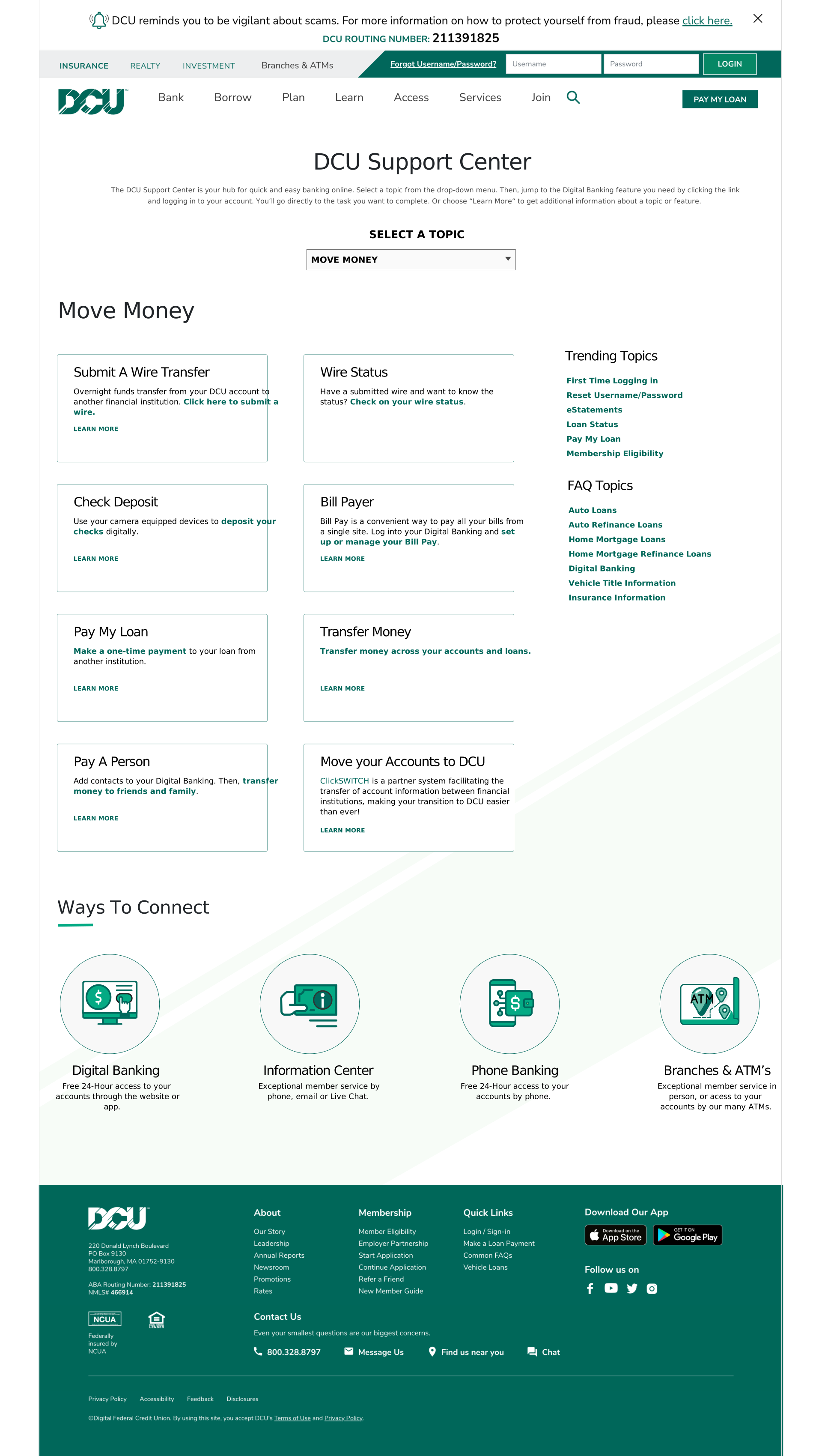
07 — Final Design
Testing confirmed Concept B as the direction. Before handing off to development, I addressed the friction points surfaced in testing centring the category dropdown for immediate visibility, adding labels to each topic tile. The revised designs were reviewed by stakeholders, minor labelling suggestions were incorporated, and the final files were passed to the dev team for build.
Once the hi-fi wireframes received final approval, they were passed on to the development team for implementation. After the site went live, we leveraged analytics to monitor and analyze user behavior.
08 — Outcomes
12%
Reduction in support call volume
67%
Self-service success rate (from 41%)
+34%
Increase in support page engagement
4.2/5
Member satisfaction score
What I’d do differently
Research started too late. Card sorting and the competitive audit happened after the initial brief, which meant correcting assumptions mid-project. Next time I’d advocate for a dedicated research sprint before any scoping. I also underestimated content migration effort — involving the content team earlier in the define phase would have surfaced that dependency before it became a schedule constraint.
What I’d repeat
The A/B test was the right call. It removed opinion from what could have been a difficult stakeholder conversation, and it gave the whole team shared confidence going into dev. Whenever two fundamentally different navigation models are in play, I’ll use this approach again.
The Support Center launched in September 2022 and was immediately promoted as a featured initiative on the DCU homepage, surfacing it directly to members on arrival. Being a large organisational initiative, it received prominent placement to drive awareness and adoption from day one.
- The page ranked in the top 10 most visited on dcu.org within its first 30 days
- Post-visit survey returned a member satisfaction score of 4.3/5.
What I’d do differently
Research started too late. Card sorting and the competitive audit happened after the initial brief, which meant correcting assumptions mid-project. Next time I’d advocate for a dedicated research sprint before any scoping. I also underestimated how long content migration would take — involving the content team earlier in the define phase would have surfaced that dependency before it became a schedule constraint.
What I’d repeat
The A/B test was the right call. It removed opinion from what could have been a difficult stakeholder conversation, and it gave the whole team shared confidence going into dev. Whenever two fundamentally different navigation models are in play, letting members decide through structured testing is always the right move.
What I’d do differently
Research started too late. Card sorting and the competitive audit happened after the initial brief, which meant correcting assumptions mid-project. Next time I’d advocate for a dedicated research sprint before any scoping.
What I’d repeat
The A/B test was the right call. It removed opinion from what could have been a difficult stakeholder conversation, and it gave the whole team shared confidence going into development.
Overview
01 Challenge
DCU’s support content existed — it just couldn’t be found. Buried across the site, it drove members to the call center instead. We had to solve both the findability problem and the fragmentation problem simultaneously.
Business Need
Support-related calls represented 23% of total call center volume — the majority asking questions already answered somewhere on the site. Each call cost approximately $8.50 to handle. Diverting just 10% to self-service would save over $200K annually.
User Need
Members didn’t want to call — they called because searching the site failed them. They encountered dead ends, irrelevant results, and content organized around DCU’s internal structure rather than their actual questions.
02 Research
Three research methods, 90+ participants, and a clear picture: members weren’t broken — the information architecture was. Card sorting with 30 members revealed how they think about bank support, while stakeholder interviews mapped the content gaps, and competitive analysis showed what great support hubs look like.
Insight 1
Card sorting showed members organize support content around what they want to do ("report a lost card") not around DCU’s product lines ("Visa Debit"). DCU’s site used product-first IA.
→ Decision: Task-based navigation architecture
Insight 2
7 of 8 stakeholder interview participants said members try the site’s search first — and give up quickly when it returns unrelated results. There was no dedicated search for support content.
→ Decision: Prominent contextual search bar at top of hub
Insight 3
Competitive analysis of Chase, Ally, and BECU revealed clear category cards with 5–7 support topics, consistent iconography, and progressive disclosure. DCU had none of these patterns.
→ Decision: Topic card grid as primary navigation
03 Define
Synthesis across all research streams surfaced a single core problem: members were being forced to think like DCU employees to find member-facing content. The information architecture mirrored DCU’s organizational structure, not how members approach their banking needs.
We translated this into three design principles. First, task language over product language — write for what members are trying to do, not what department owns the content. Second, progressive disclosure — show the most common questions first; let users drill down for edge cases. Third, multiple entry points — search, browse by topic, and browse by account type, because no single navigation pattern works for everyone.
04 Ideate
We pushed two concepts into low-fi wireframes based on different hypotheses. Concept 1 put search at the center of the experience with minimal visual structure. Concept 2 led with a visual topic card grid that let members scan and self-route by category.
Concept 1 — Search-first
A minimalist entry page with a large search bar. Browse was secondary. Hypothesis: members who already know what they need will self-serve faster if search is frictionless. Risk: members who aren’t sure what to search for would still be stuck.
Concept 2 — Browse-first
A topic card grid with 8 category tiles (Cards, Loans, Account Access, etc.) plus a search bar. Hypothesis: visual scanning lets uncertain members discover the right category without formulating a search query. This aligns with how members described their mental models in card sorting.
The team reviewed both directions against research findings. The sitemap and task flows were built from Concept 2’s architecture — but we kept the A/B test open to let real user data make the final call.
05 Design
Desktop-first, then mobile. Lo-fi concepts were pressure-tested by the team against our design principles before a single pixel of color was added. The question at every stage was the same: can a member who has never used this page find their answer in under 60 seconds?
Hi-fi wireframes introduced DCU’s design system while solving two gaps the lo-fi hadn’t resolved: FAQ topic labels (which card sorting had surfaced as essential vocabulary for members) and a persistent search bar on article pages so members could pivot mid-journey without backing out to the hub.
06 Test
A/B test via Maze — 60 participants split evenly across both concepts. We measured task completion rate, time-on-task, error rate, and a post-task confidence survey. The study was moderated by an outside research partner to reduce observer bias.
87%
Task completion, Concept 2
06 Test
A/B test via Maze — 60 participants split evenly across both concepts. We measured task completion rate, time-on-task, error rate, and a post-task confidence survey. Concept 2 won on every metric.
87%
Task completion, Concept 2
54%
Task completion, Concept 1
1:42
Avg. time to answer, C2
4.1/5
Confidence score, C2
Concept 1 session recordings revealed a consistent abandonment pattern: participants typed a query, scanned unrelated results, and gave up within 30 seconds. Concept 2's topic cards let members find a category even without the right search terminology — solving the vocabulary problem card sorting had surfaced.
06 Test
A/B test via Maze, 60 participants split across both concepts. Concept 2 won on every metric.
06 Test
A/B test via Maze — 60 participants split evenly across both concepts. We measured task completion rate, time-on-task, error rate, and a post-task confidence survey. Concept 2 won on every metric.
87%
Task completion, Concept 2
54%
Task completion, Concept 1
1:42
Avg. time to answer, C2
4.1/5
Confidence score, C2
Concept 1 session recordings revealed a consistent abandonment pattern: participants typed a query, scanned unrelated results, and gave up within 30 seconds. Concept 2’s topic cards let members find a category even without the right search terminology — solving the vocabulary problem card sorting had surfaced.
06 Test
A/B test via Maze — 60 participants split evenly across both concepts. We measured task completion rate, time-on-task, error rate, and a post-task confidence survey. Concept 2 won on every metric.
06 Test
A/B test via Maze — 60 participants across both concepts. Concept 2 won on every metric.
87%
Task completion, Concept 2
54%
Task completion, Concept 1
1:42
Avg. time to answer, C2
4.1/5
Confidence score, C2
Concept 1 session recordings showed a consistent abandonment pattern: participants typed a query, scanned unrelated results, and gave up within 30 seconds. Concept 2’s topic cards let members find a category even without the right search terminology — solving the vocabulary problem card sorting had surfaced.
07 — Priority Revisions
12%
Reduction in support call volume over 90 days
67%
Self-service success rate, up from 41%
34%
Increase in content engagement
4.2/5
Member satisfaction score, post-launch
The call volume reduction translated to approximately $166K in annual savings against a projected $200K target. More importantly, members who previously called DCU for common questions were now resolving them independently — which is the outcome the business needed and the experience members deserved.
Concept B was the clear winner but testing surfaced two friction points worth addressing before development. Participants were unsure whether the dropdown was interactive — they noticed the topics but didn’t immediately register that selecting one would filter the content. A second issue was font size within the topic listings, though this was partially attributed to prototype fidelity rather than the design itself.
Two changes were made to the Concept B design before stakeholder review: the category dropdown was repositioned to sit centred on the page and given greater visual weight, making the filtering mechanism immediately visible on arrival. Labels were also added to each topic tile to reinforce what each category contained and reduce ambiguity.
The revised design was presented to stakeholders and received a strong reception. Minor suggestions around the labelling of specific topics were incorporated, and the final designs were handed to the development team. The new Support Center page was scheduled to release in September 2022, with KPIs defined to track and measure performance post-launch. A follow-up iteration cycle was planned for three weeks after release.
08 Reflection
The research was strong, but we started it too late. Card sorting and the competitive audit happened after the initial brief was written — which meant we were correcting assumptions mid-project rather than building on a clean foundation. Next time, I’d advocate for a research sprint before any scoping conversations.
I also underestimated how long content migration would take. The IA redesign required every article to be recategorized — that’s a content operations problem, not a design problem, but it affected our timeline. Involving the content team earlier in the define phase would have surfaced that dependency before it became a constraint.
The A/B test was the right call. It removed subjectivity from what could have been a difficult stakeholder conversation, and it gave the team shared confidence going into development. I’d use this approach again on any project where two fundamentally different navigation models are in play.
Next
Explore more work from the portfolio.