
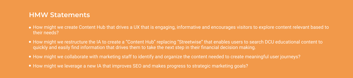
DCU needs to re-design Financial Education by creating a new content hub that is easy to use, provides information on topics relevant to users and encourages website visits for experiences other than making banking transaction.
DCU.org has a complex and convoluted information architecture and taxonomy. Users don't know where to look for educational content as it is scattered across the website. The main goal is to provide a clear and easy to navigate experience to financial education and information for visitors and drive a greater engagement with DCU.org.
consumer ux | banking
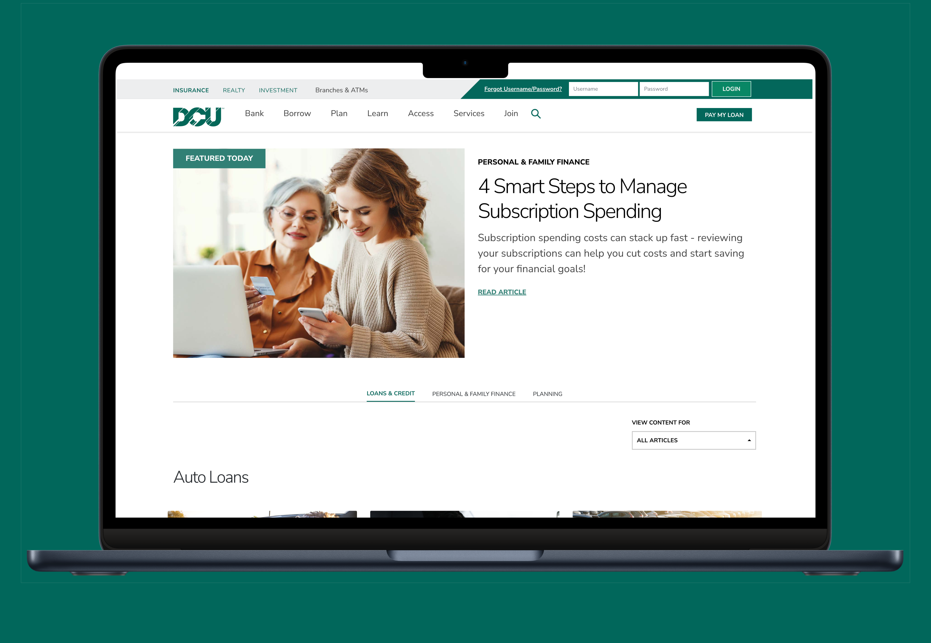
Designing a Financial Education Center that structures learning around real-life financial goals, helping members explore content more deeply and stay engaged beyond transactional banking.
Visit Live Site →Case Study · DCU Federal Credit Union
 Visit Live Site →Visit Live Site →Visit Live Site →
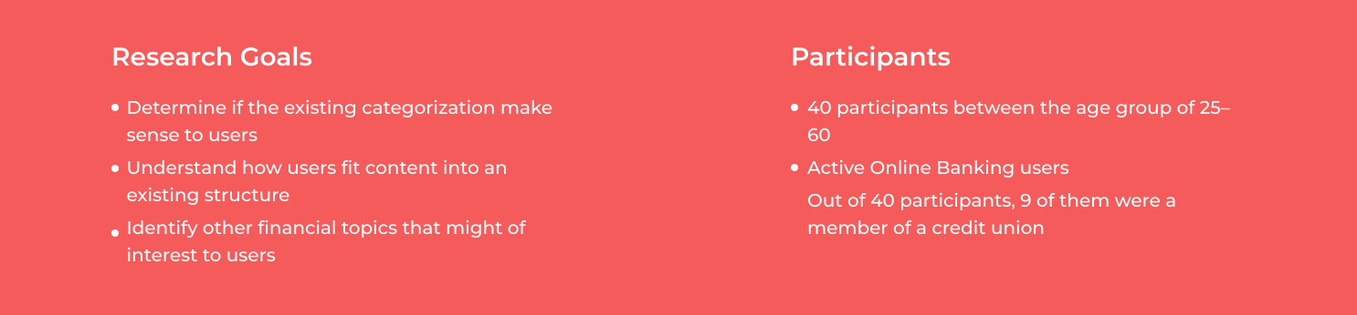
I started by developing a Research Plan to outline research goals, assumptions, methodologies, and timeline. Also, to ensure the research stays on track. I identified which customers should I target initially, what the best research methods are, and what the key areas of inquiry are. It helped me structure my approach to understand the opportunities in this area.
.svg)
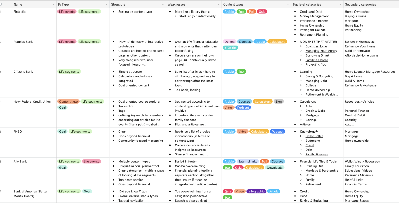
I performed competitive analysis on direct and indirect competitors to identify their strengths & weaknesses and looked at their approach to solving a similar problem.
We conducted several workshops with stakeholders to understand the problem space at hand and to brainstorm ideas for organizing and labeling the content. The goal was to come with a categorization of educational content.
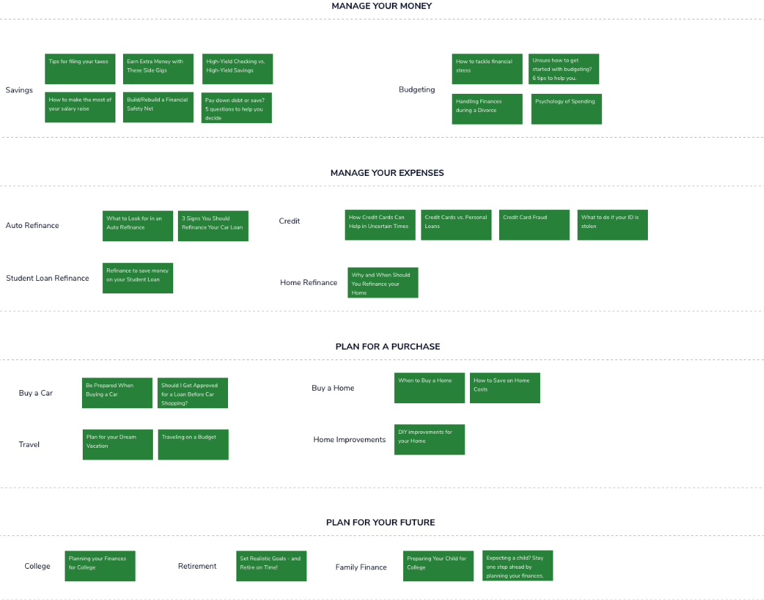
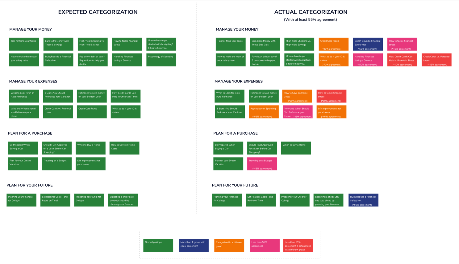
Closed card sorting research technique was performed to analyze the categorized educational content.. Participants were asked to sort 29 cards into 4 pre-defined categories. Also, we wanted to find out how users fit content into an existing structure and if the existing primary level categories make sense to them.
.svg)
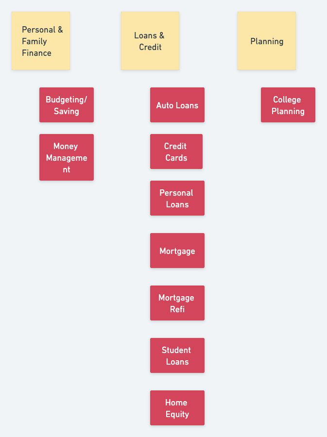
Card sorting results made us to rethink how we organized our content & labeling. We conducted another set of workshops to brainstorm ideas & to come up with simple & easy to understand category labels. The goal was to think from the user perspective & not from what we want it to be. Once we were done with the categorization & labeling, we performed a tree test to verify our ideas. The results were encouraging and lot more positive.
01 — Overview
The Problem
DCU.org offered a wide range of financial education content, but it was spread across the site with no clear entry point. The information architecture reflected internal structures rather than how members approach learning, making it difficult to explore topics or understand where to start.
My Approach
Led end-to-end UX design to define a new Financial Education Center. Research included competitive analysis, stakeholder workshops, closed card sorting, and tree testing to develop a clear taxonomy grounded in how members think about financial topics and learning journeys.
The Outcome
Delivered a responsive financial education hub with a simplified taxonomy and goal-based navigation, enabling members to explore educational content more intuitively. The solution was handed off to development for launch on dcu.org.
After synthesizing research findings and uncovering needs, next step was to define project goals that allowed me to look at a fresh perspective on the problem from the user’s point of view. I combined business goals from the initial Design Brief and user goals from my Empathy Map, taking into account technical considerations, to visualize how to prioritize features to design for the minimum viable product.
02 — The Problem
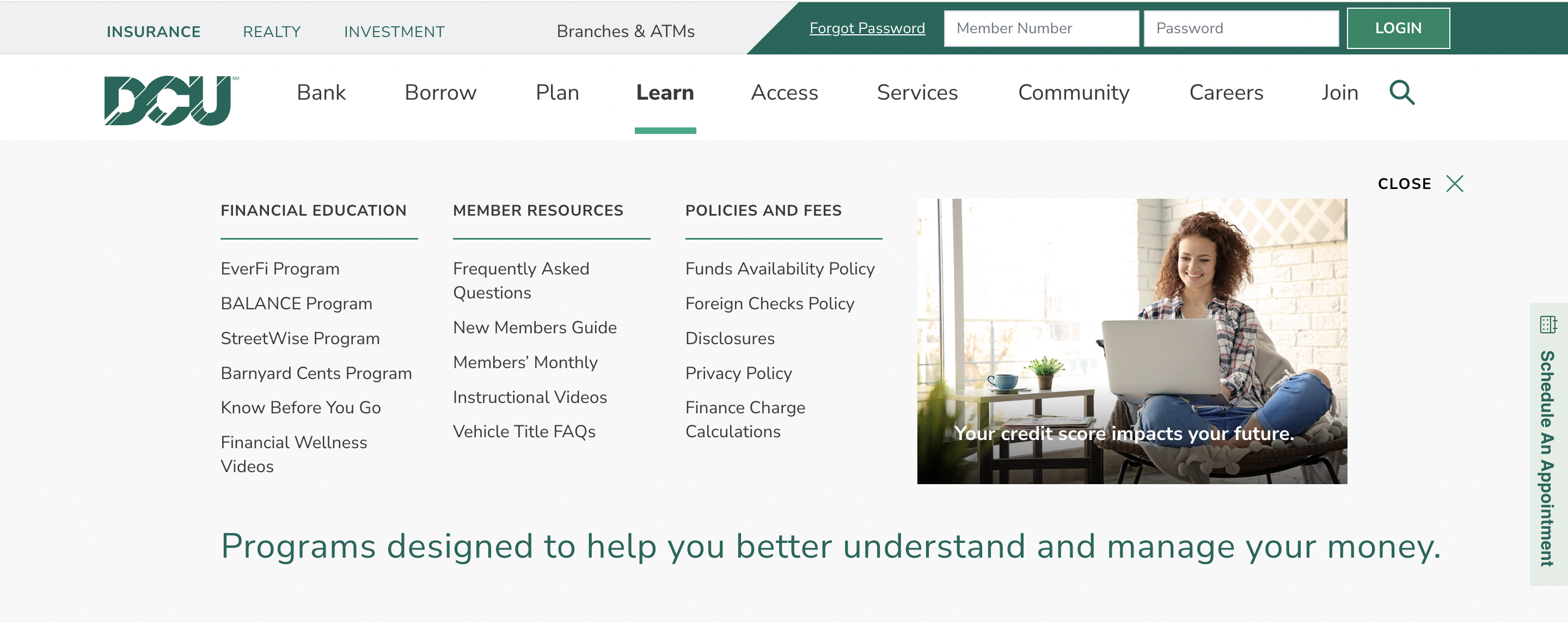
DCU.org had financial education content across the site but members couldn't find it. The IA was built around DCU's internal product structure ("Streetwise"), not how members think about money.
Business Need
The existing “Streetwise” content hub had low engagement. DCU needed a redesigned experience that would drive visits and position the site as a financial resource, not just a transaction tool.
User Need
Members wanted financial guidance but couldn’t navigate to it. Content was buried under product-centric labels that didn’t match how users thought about their financial needs.
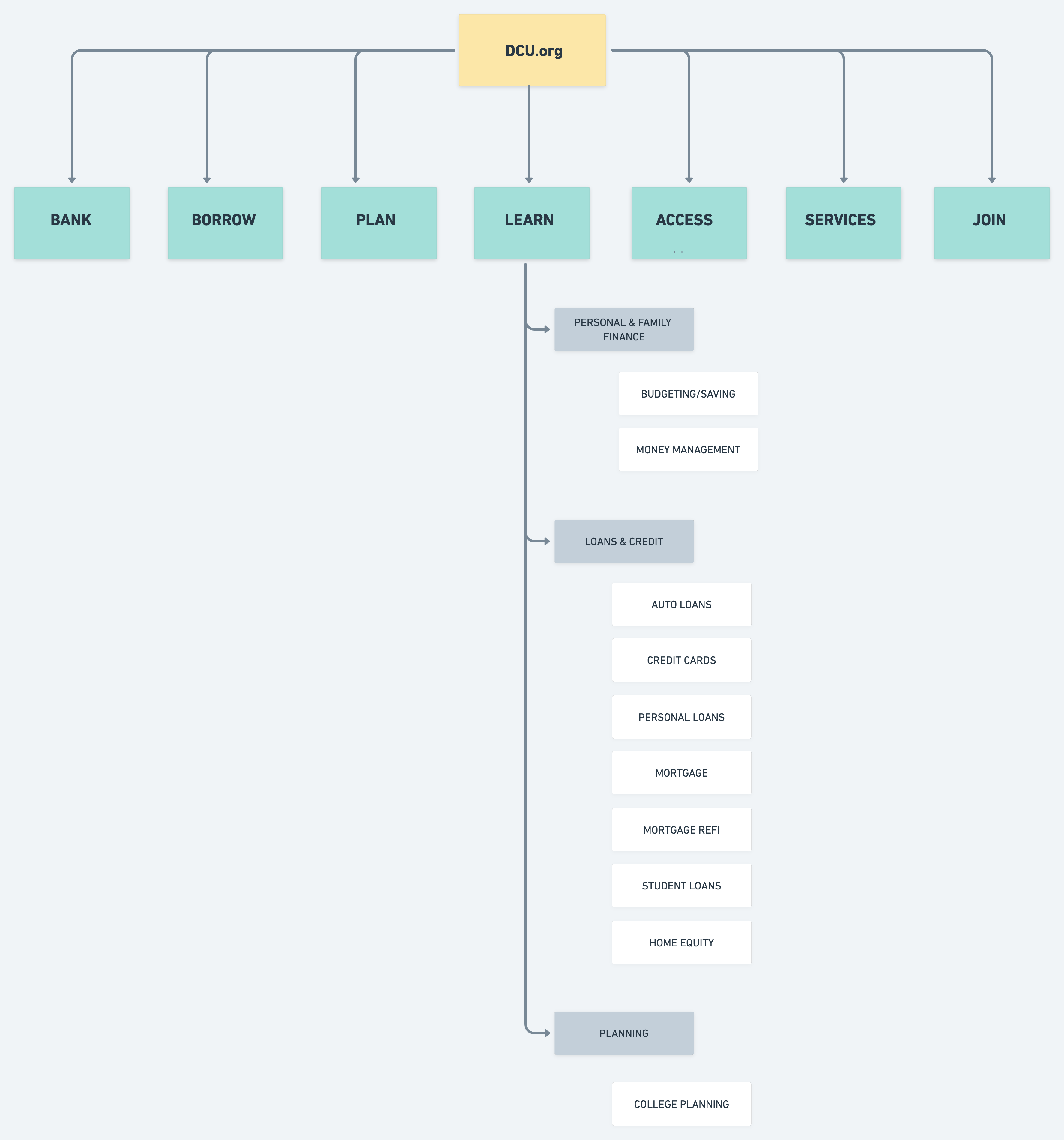
Building from the product goals, feature roadmap, and card sorting results, I created a sitemap that included proposed pages to help plan the structure of the website. By visualizing the information architecture and identifying key relationships between screens, we can better understand the flows and interactions throughout the site.
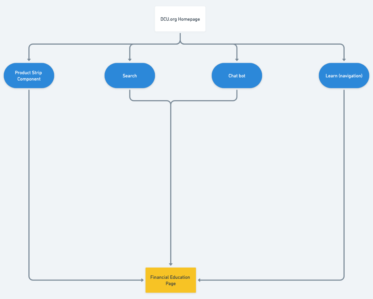
To further analyze the flow, I explored the possible paths using a user flow diagram that users could take while looking for educational content. This process ensures we account for all screens that users will need in order to complete tasks.
03 — Research
Research combined stakeholder workshops, competitive analysis, and card sorting to understand how members approach financial education. Across methods, one pattern emerged: existing categories reflected internal structures rather than how people naturally explore financial topics.
Competitive Analysis
Direct and indirect competitors used topic-based content hubs, not product-based navigation. This validated the need for a task-oriented IA rather than mirroring DCU’s internal structure.
Stakeholder Workshops
Workshops with DCU stakeholders surfaced proposed content categories. The goal was to establish a starting taxonomy to test with real users before committing to any structure.
Card Sorting
29 cards, 4 pre-defined categories, closed sort. Results showed the existing labels didn’t match how users grouped financial topics — prompting a full taxonomy revision.
Stakeholder Workshops
Workshops with DCU stakeholders surfaced proposed content categories. The goal was to establish a starting taxonomy to test with real users before committing to any structure.
Competitive Analysis
Direct and indirect competitors used topic-based content hubs, not product-based navigation. This validated the need for a task-oriented IA rather than mirroring DCU’s internal structure.
Card Sorting
A closed card sort was conducted to evaluate whether the proposed education categories aligned with how users interpret financial topics.
Key Insights from the Results
1) Strong alignment: Content tied to concrete financial goals such as saving, buying a home, or planning showed high agreement and validated parts of the initial taxonomy.
2) Category confusion: Several articles were grouped differently by participants, revealing that financial education content doesn’t map cleanly to product-based labels. Examples included:Credit card topics shifting between “Manage Your Money” and “Manage Expenses”. Emotional or behavioral topics (e.g., financial stress, psychology of spending) falling outside expected categories. Refinancing and loan-related content being interpreted across multiple financial contexts
3) Design implication: The findings highlighted the need to simplify categories and shift toward broader, goal-driven groupings rather than narrowly defined financial products.

I started the design phase after understanding the technical, business & user requirements.I designed a couple of low-fi concepts based on research & goals and presented them to the team for feedback. I used common design patterns and established the sizing & placement of content elements. Since the goal was to create a responsive design, I first started with desktop versions and based on the feedback, I iterated on it and then jumped to mobile wireframes. I focused on keeping consistency across screens & devices I hoped to discover any issues that could be resolved before working on the visual design.
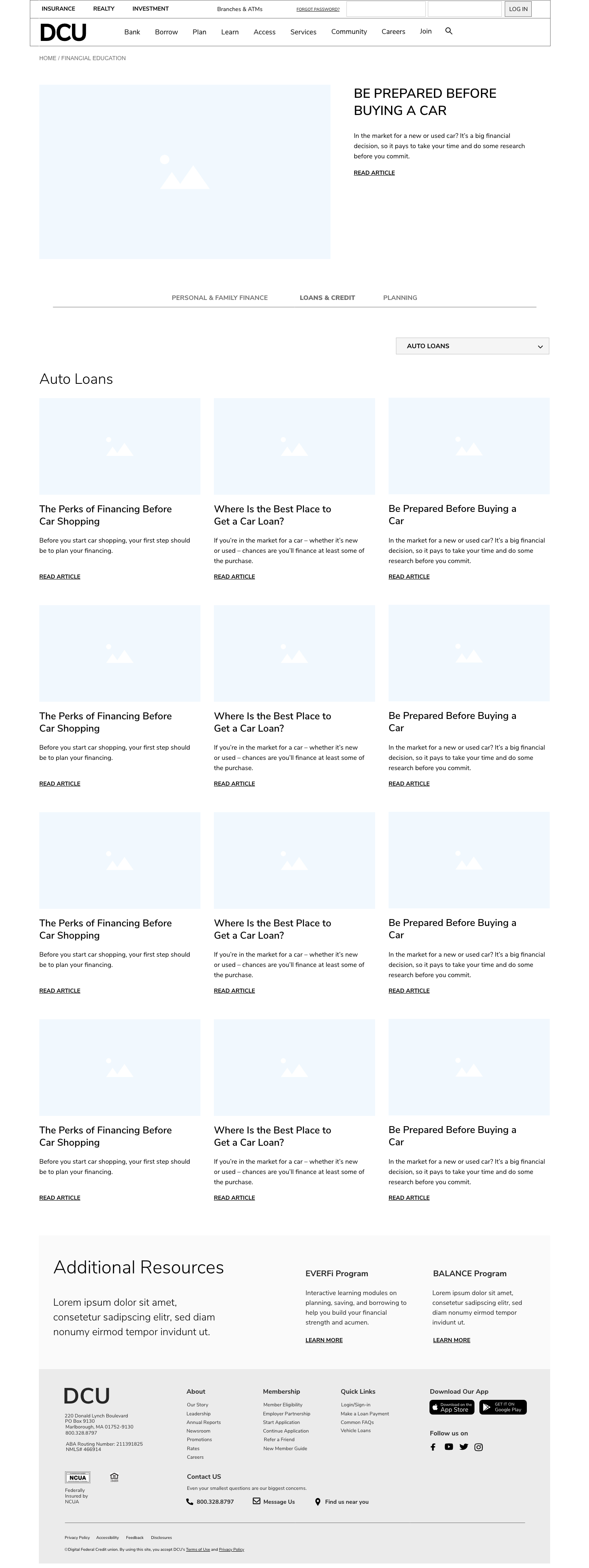
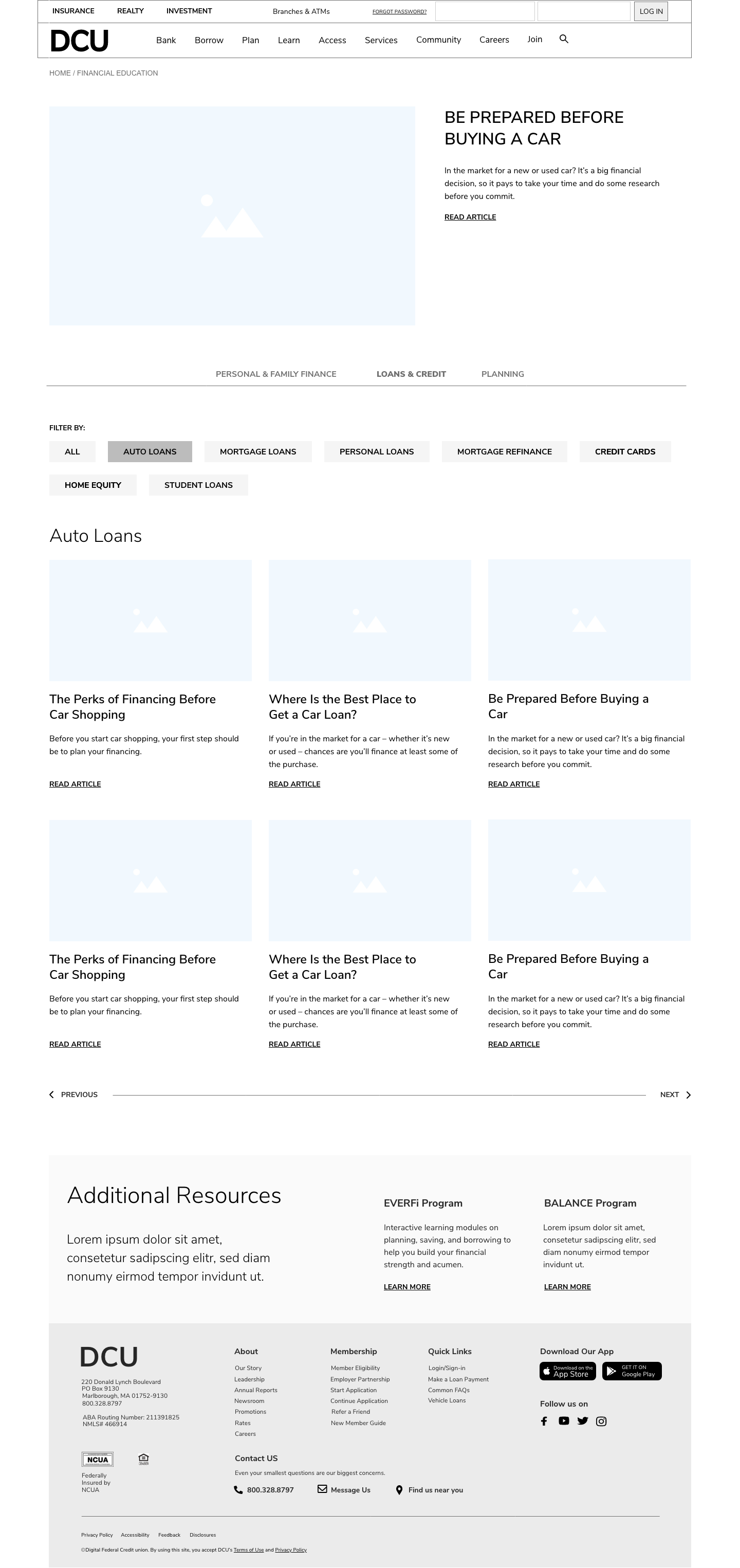
Presented low-fi concepts to the team to gather feedback. Concept 1 was preferred by the team. Based on their feedback, I iterated on it and designed mobile wireframes for responsive design.


04 — Define
Card sorting results drove a full rethink of how content was labeled and grouped. Another round of workshops produced simpler, user-centered categories validated with tree testing before moving into structure. From there, a site map and user flow mapped out the new IA.
Revised Taxonomy
Three user-centered categories replaced the existing product-led labels — Personal & Family Finance, Loans & Credit, and Planning.
Site Map
The new IA mapped content under the revised taxonomy, visualising page structure and key relationships across the hub before any screens were designed.
Revised Taxonomy
Three user-centered categories replaced the existing product-led labels Personal & Family Finance, Loans & Credit, and Planning.
Site Map
The new IA mapped content under the revised taxonomy, visualising page structure and key relationships across the hub before any screens were designed.
After my prioritized revisions, I handed off the design to the dev team for development. This project was a high priority for business and with tight deadlines, a decision was made not to perform usability testing.
05 — Design
Desktop Wireframe — Concept 1
Desktop Wireframe — Concept 2
Mobile Wireframe — Concept 1
Mobile Wireframe — Concept 2
User Flow
With the IA and goals defined, I moved into sketching. Two desktop concepts were developed and presented to the team each exploring a different approach to content hierarchy, navigation placement, and hub layout. Concept 1 was selected. I iterated based on team feedback, then adapted the approved direction into mobile wireframes to validate the responsive design.
Concept 1 prioritised the user goal surfacing the most relevant content up front with clear signposting for each financial topic. Topic-led hub with goal-oriented navigation. Content is organised by financial topic (budgeting, saving, debt, etc.) with featured resources surfaced at the top of each section. This pattern mapped directly to how members described finding help by life situation, not content type.
Concept 2 with faceted filtering: Content is browsable by categories with topic tags as a secondary filter. It was not preferred due to concerns that the pattern would become less effective in responsive layouts and perform poorly on mobile.
Once Concept 1 was approved, the desktop direction was adapted into mobile wireframes. The shift to mobile introduced layout constraints that influenced key design decisions, particularly around how categories were structured and navigated.
06 — Reflection
After my prioritized revisions, I handed off the design to the dev team for development. This project was a high priority for business and with tight deadlines, a decision was made not to perform usability testing.