
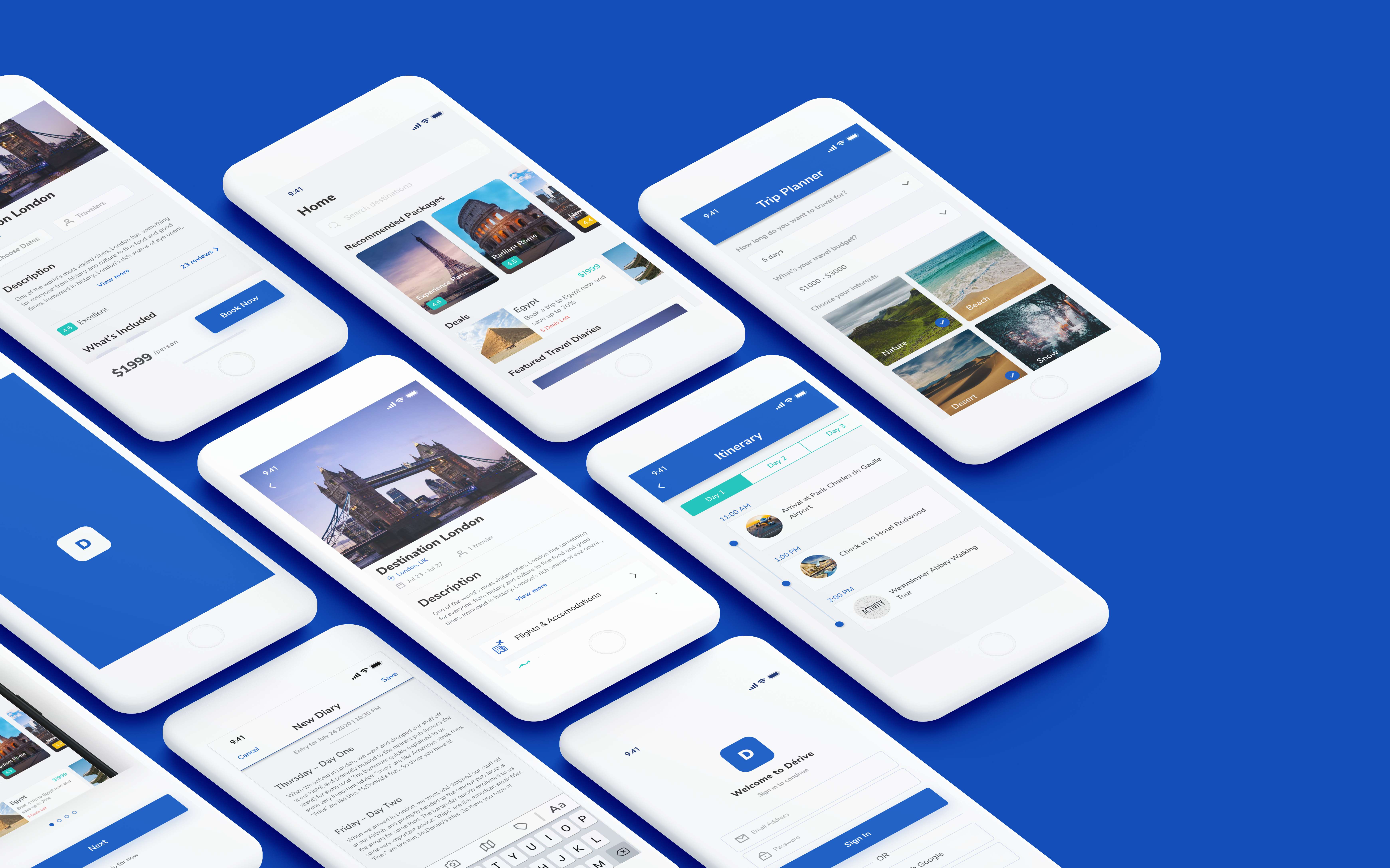
Derive is a platform designed to provide a unique & personalized experience to travelers. The purpose of this app is to provide a one-stop solution that caters the needs of different kinds of travelers.
Travelers want to enjoy experiences, but they don’t want to spend their time planning trips. The apps currently in the market are not meeting these goals.
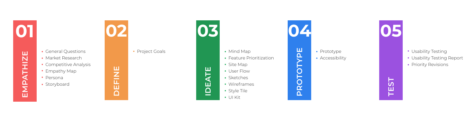
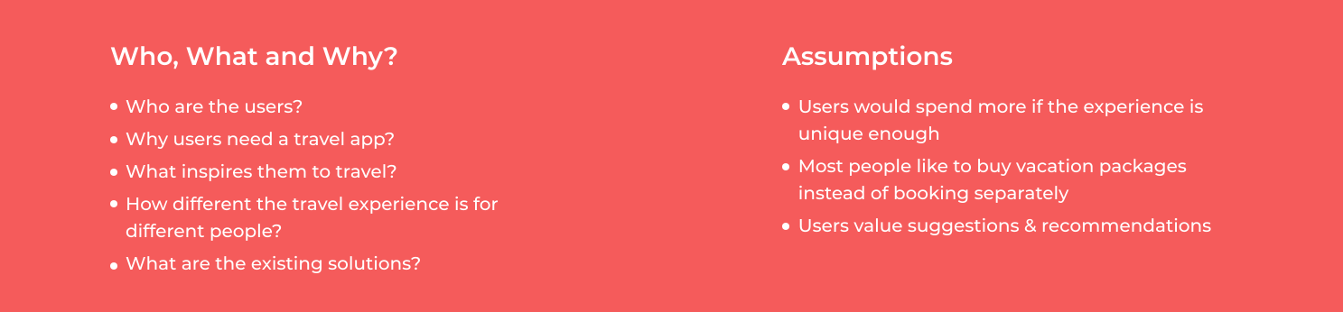
I started by asking questions to empathize with user problems, difficulties, and needs. I identified which customers should I target initially, what the best research methods are, and what the key areas of inquiry are. It helped me structure my approach to understand the opportunities in this area. After that, I made some assumptions that I wanted to verify through research
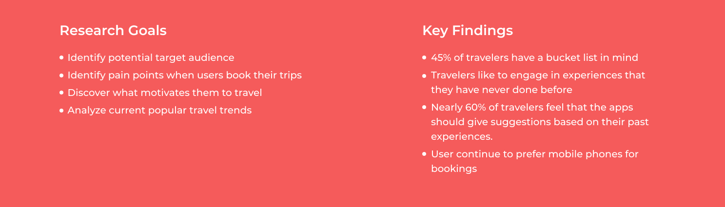
I gathered information about companies offering vacation pacakges, unique destination booking, and adventure travel to see how they approached booking and selling tickets and gain a deeper understanding of the market.
After gathering data through market research, I conducted competitive analysis of the selected competitors. To perform this analysis, I considered what key factors I wanted to analyze. This analysis led me to a clearer vision of what are the common features across the existing solutions, what do they offer, and if there is a niche that I could fit into.
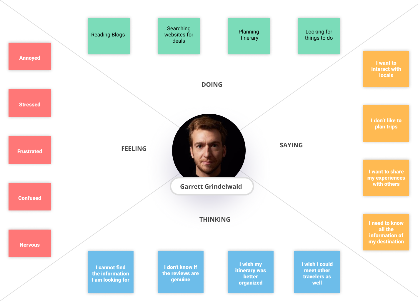
I gathered raw data from my research and pulled out my observations and assembled them into an empathy map, which had 4 categories: doing, saying, feeling, and thinking. The objective was to have a user-centered frame of mind to look for common patterns and pain points that would help me define my project goals.
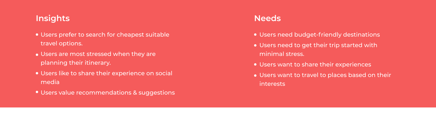
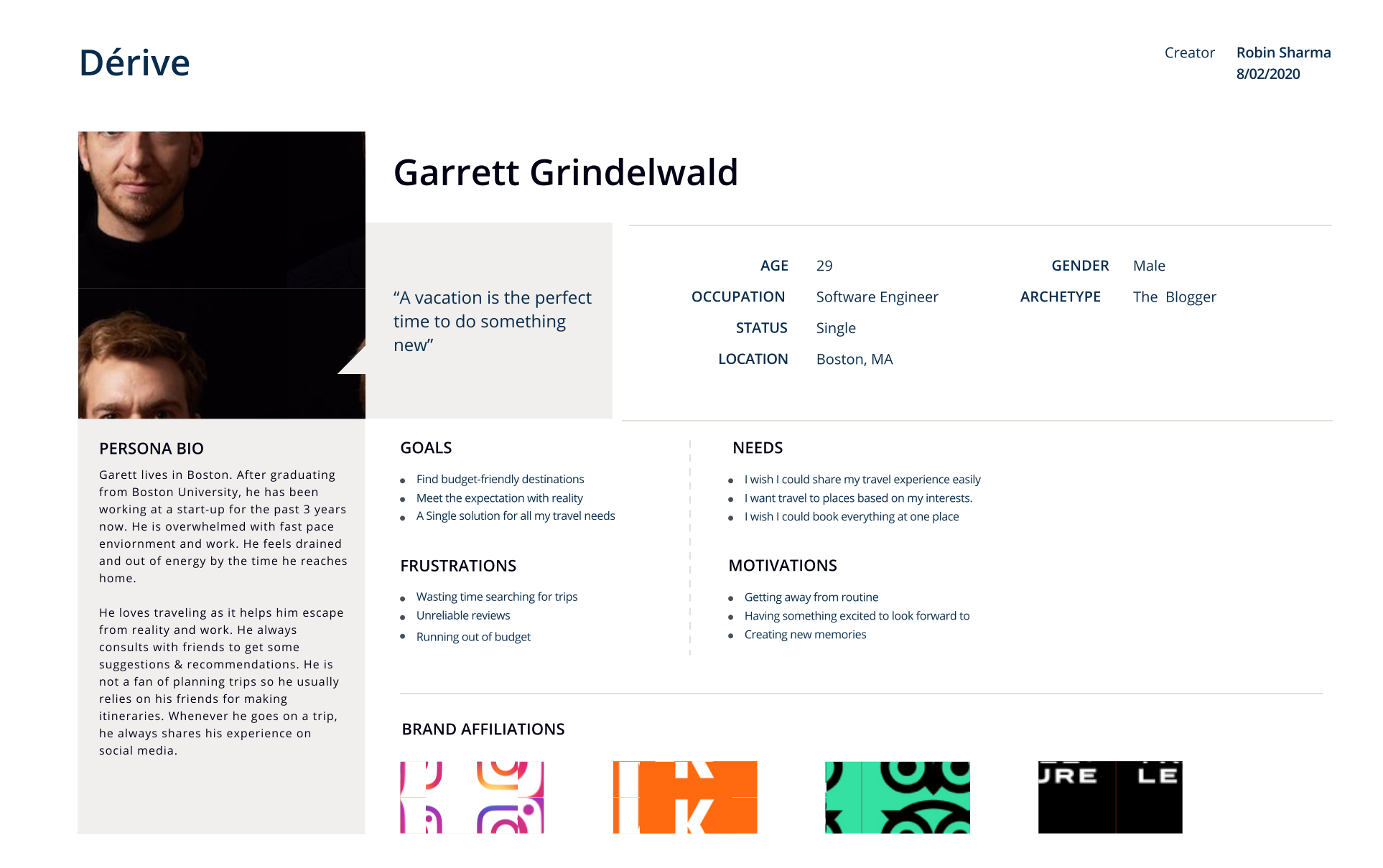
I created a persona that embodies the insights from the previous research and from the empathy map. This will help focus our design on and understand our target audience. I used this persona as a reference tool to build empathy and to think about Garrett, whenever I had to make a design decision.
I also drew up a storyboard to help further emphasize with the persona, Garrett, and how exactly his process of getting involved with Derive might look like. It helped me give context as to what Garrett is doing and also where he is and why is he performing that task.
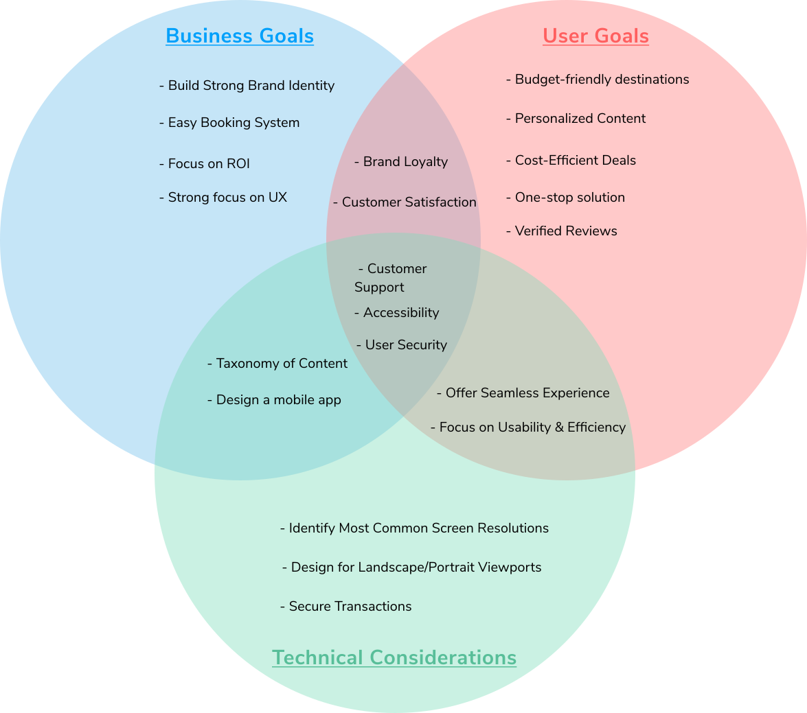
After identifying user goals, I tried to understand the details and scope of the business & technical goals. I’ve created a Venn diagram to brainstorm these goals and to further help inspire design decisions.
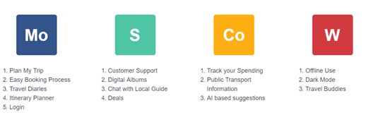
Mind map helped me identify lot of different features quickly. Since, I was working under tight timelines so I started prioritizing based on impact and complexity. This helped me plan out the initial design and define the scope of the initial build of the site. For that, I used MoSCoW prioritization technique.
Based on feature prioritization, I created an outline of how the app’s pages would be organized by creating a site map. This provides a baseline of pages that need to be included and gives us a skeleton of potential site workflows.
.png)
Before starting on wireframes, I wanted to map out how a typical user, like Garrett, might move through the app. I first defined 5 scenarios by referring to the site map and from there, I designed a flow that showed how users would complete these scenarios The user flow below shows different entry points to the app.
.png)
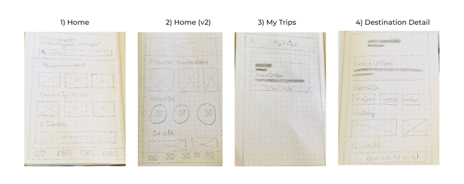
Before going digital, I sketched several variations of what the app might look like. These rough sketches helped to provide a quick and low cost way to explore multiple ideas before digitizing our design.
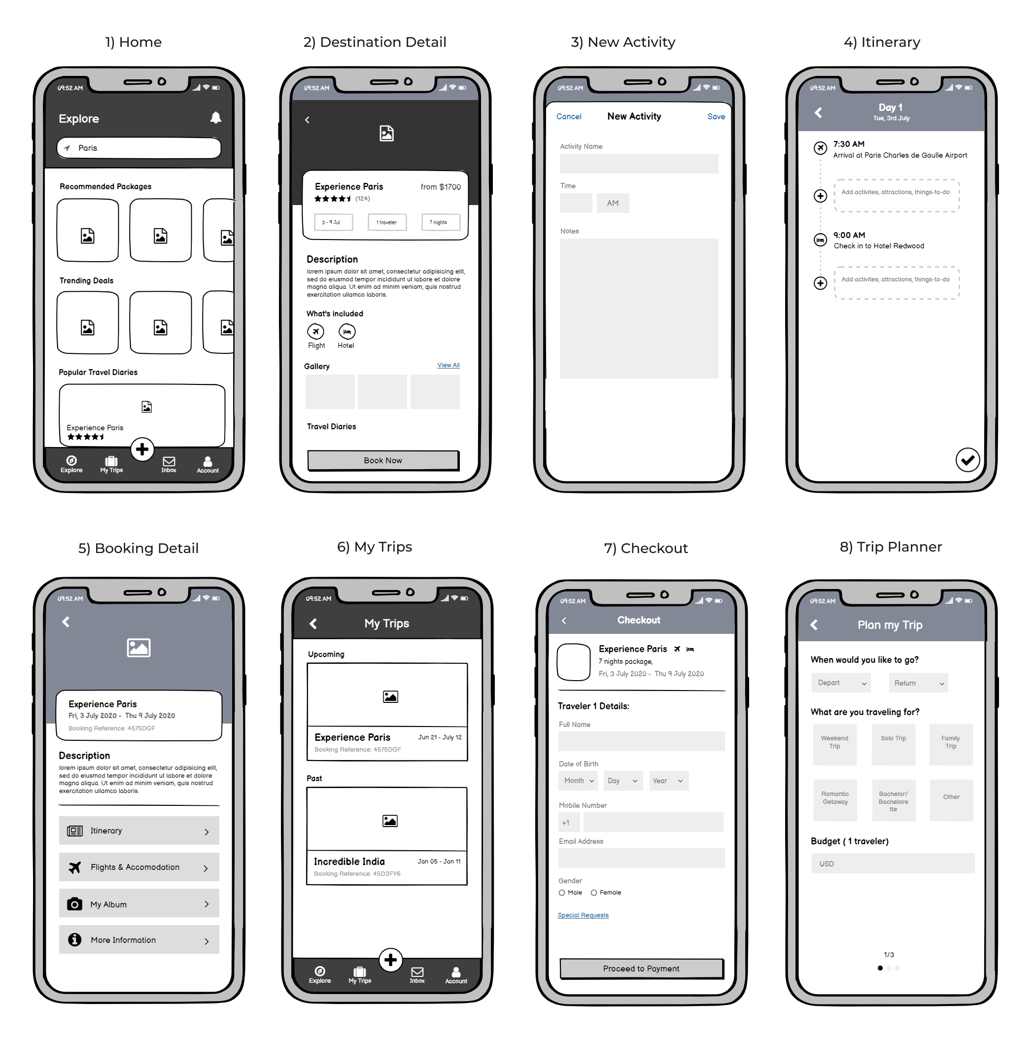
I chose to follow one of the directions from my sketches, and referencing my past work, design pattern libraries, and competitor websites, I first created some initial wireframes on Balsamiq. After getting feedback from my Professor, I iterated on my designs and made changes to it.
Before detailing Derive’s branding, I needed to first identify the visual style the branding would follow. So, I defined brainstormed a few concepts around attributes that represented the brand.

After defining my brand guidelines. I created a Mood Board on Pinterest for inspiration on typography, color, logo design, & overall visual direction.
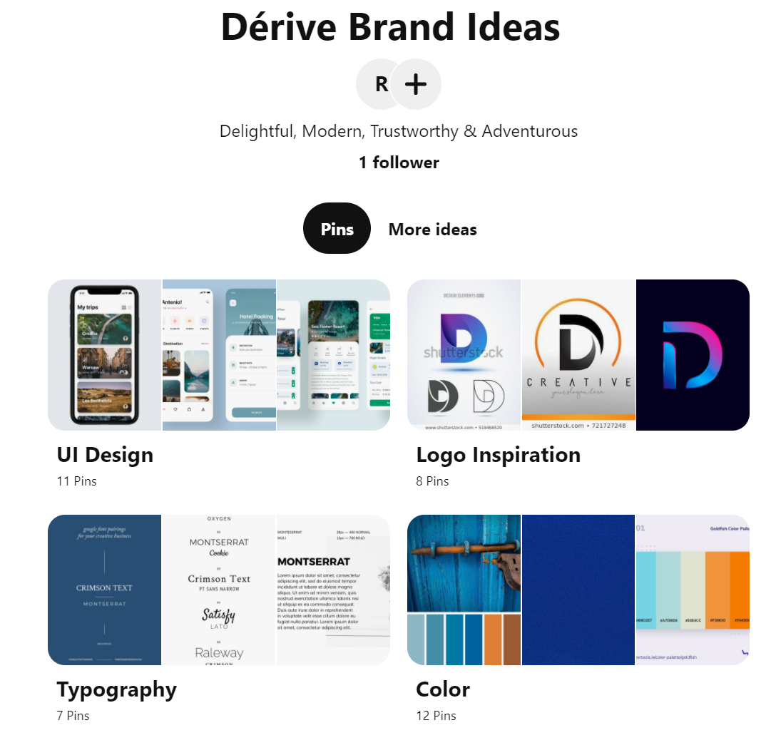
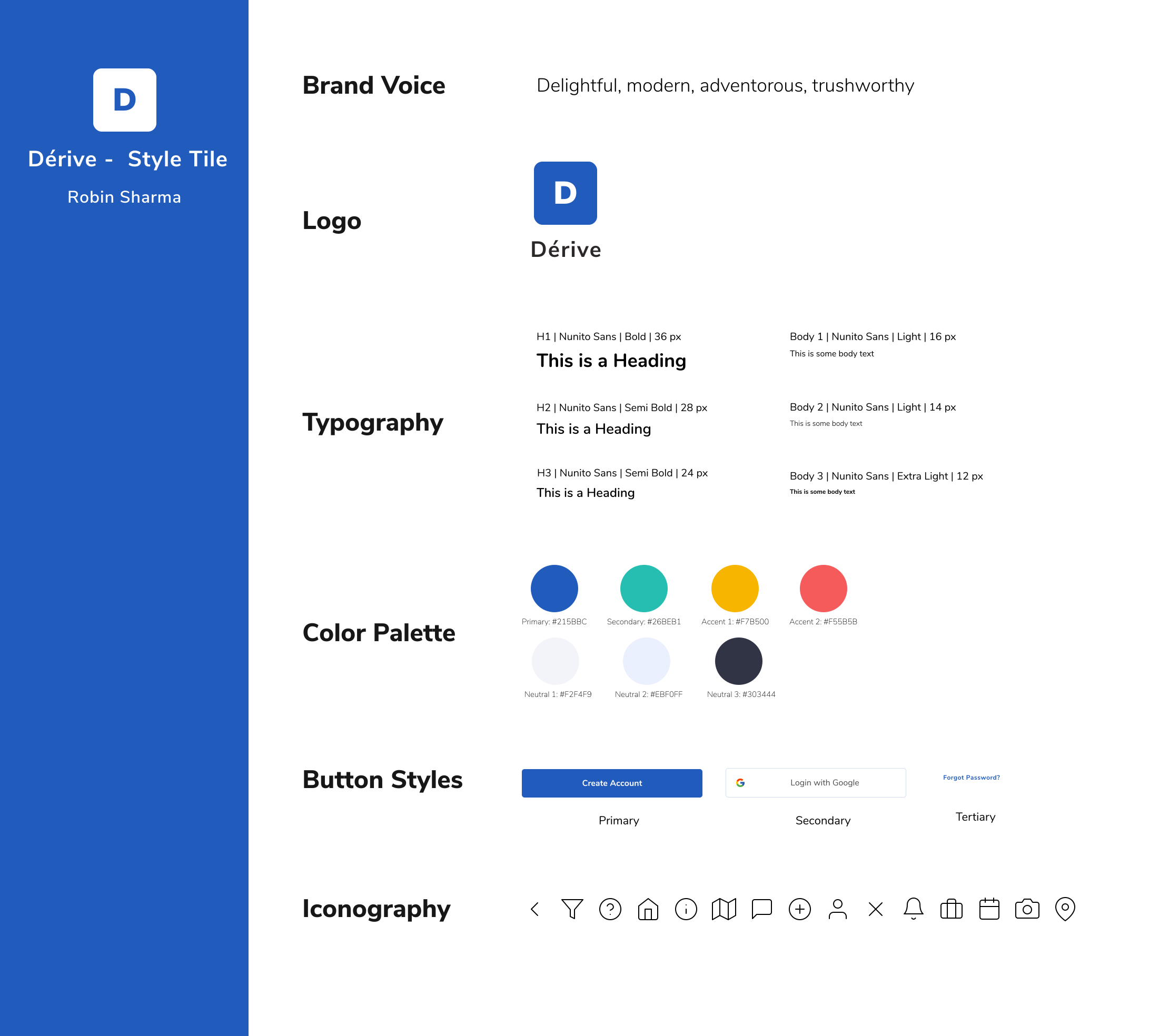
Pulling inspiration from the moodboard, I created a style tile that incorporates brand voice, logo design, color palette, typography, button styles & iconography This style tile served as the foundation of the site's interface design.
I applied the UI design to the set of mid-fidelity wireframes created earlier in order to create high fidelity mockups.
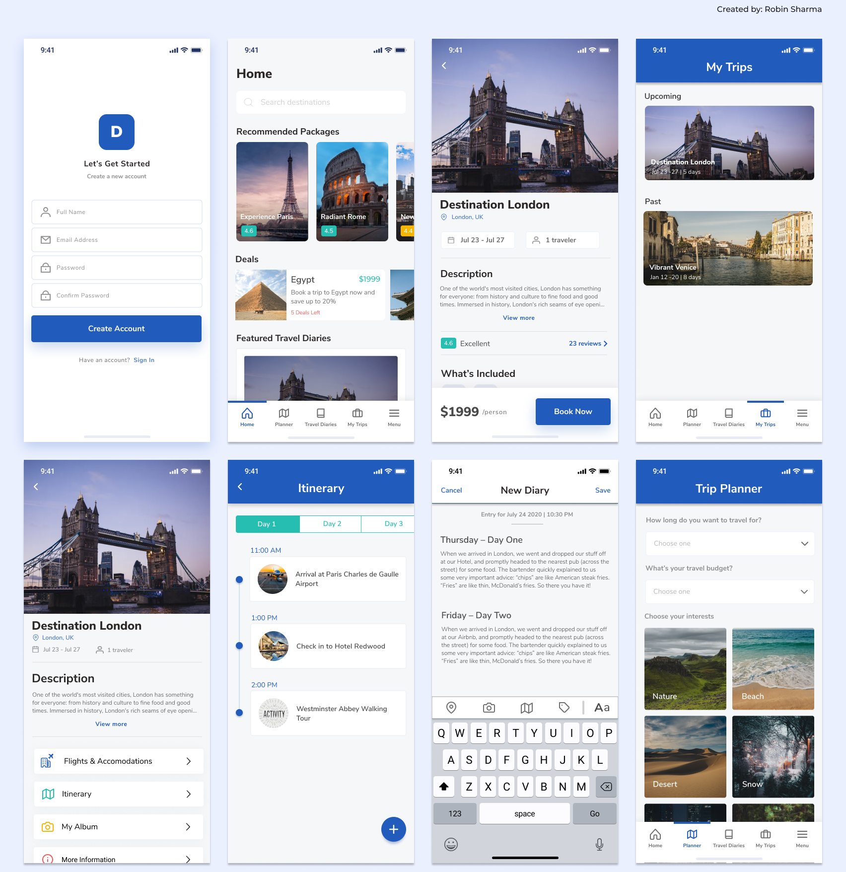
The next step was to create a working prototype. I used Figma to create the prototype to test with users. The prototype had clickable buttons, simulated page transitions and animations that roughly matched my experiential concepts for usability testing.
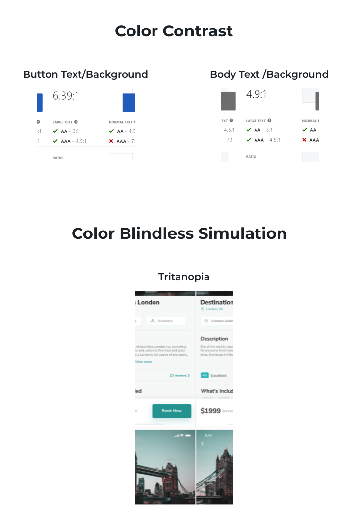
In order to be compatible with Web Content Accessbility Guidelines (WCAG), I used a tool called “Stark” to check for color contrast . I also ran a color blindness simulator to see how design looks like with various types of colorblindness. The below image shows how a user suffering from Tritonopia would see the screen.
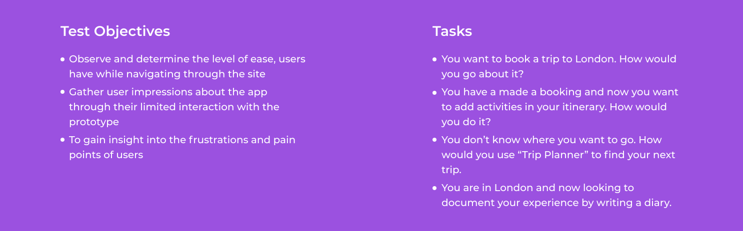
I developed a Testing Plan that detailed the project goals, objectives, and procedures. The testing plan helped to set expectations for the kinds of feedback I was hoping to receive and finalize on the aspects of the design that need testing.
I conducted “Remote Unmoderated Testing” with 6 participants on UserTesting.com. The participants were asked to complete few scenarios in a recorded session. For this testing, I decided to evaluate the following features of the prototype:
After that, I evaluated the quantitative and qualitative data the tests provided and identified high and low points concerning the usability of the interface.
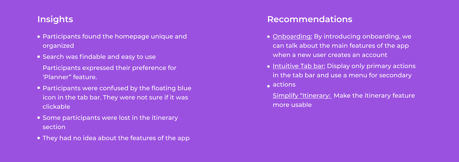
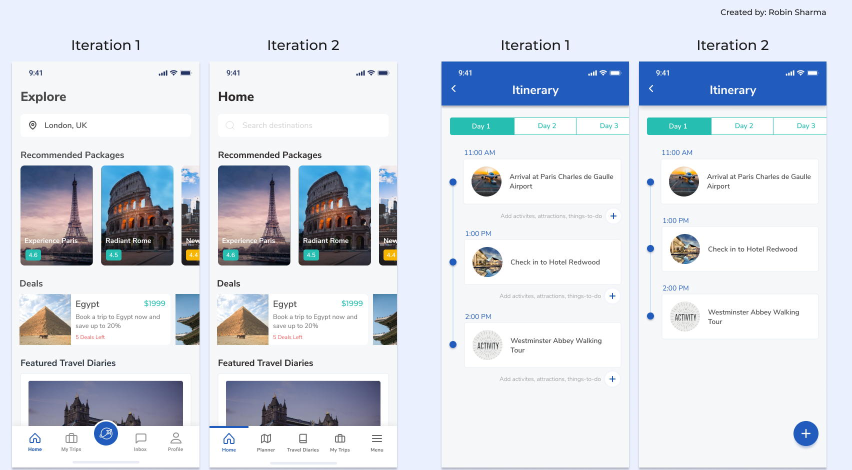
I updated the prototype based on the recommendations that I got from Usability Testing. The final changes are shown below:
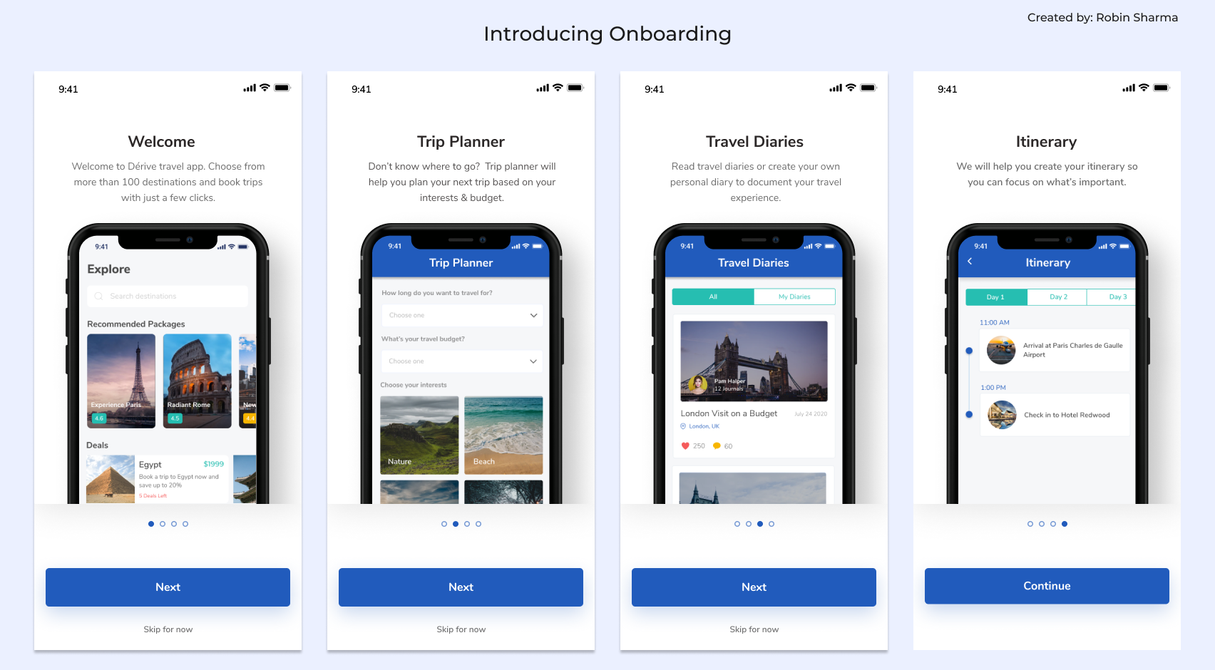
My next steps would to conduct another round of usability testing after making the priority revisions and continue iterating on it. Also, I have created a product backlog and would like to add “could have” and “won’t have” features.